


Estimating Vaccine-Induced Mortality, Part I
The Chloroquine Wars Part LII

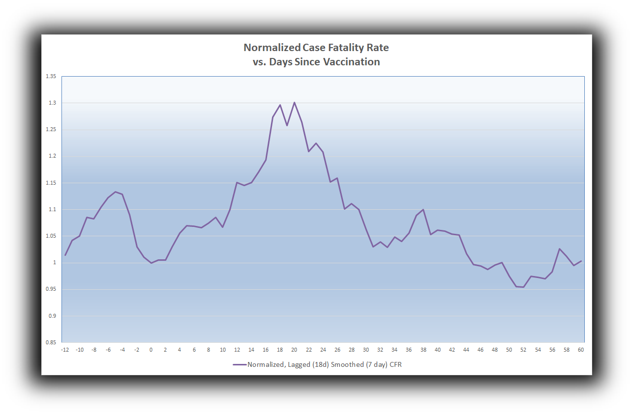
Sadly, this picture suggests that there were an estimated more than 17,000 vaccine-induced deaths during the first month of COVID-19 vaccinations throughout Europe, out of just over 17 million vaccine doses delivered. This is going to take some time to explain.
Over the past few months, my concerns over vaccine safety have grown steadily. At first I took the personal approach of "I'll wait and see what the aggregate results of these experimental vaccines look like," but was mostly focused on the bizarre sabotage of early treatment medication. I did write up thoughts regarding vaccine risks (here and here) because I felt that the risk assessment was irresponsibly ignored, and I wrote up assessments of the UK's PHE data (here and here) because it seemed to me that the benefits of the vaccines were overstated, based on the data. When I discussed vaccine safety data with Steve Kirsch, I pushed back multiple times at his theory that there were perhaps 50,000 vaccine-induced deaths in the U.S., proffering a more modest number, and having a hard time squaring the complete disinterest in the topic by the medical community. I thought then and still think now that vaccine-induced deaths could be greater than most people in medicine would realize due to standard human lack of intuition regarding the interplay of very large and very small numbers.
My worry about vaccine-induced deaths grew somewhat when I became more aware of the intersection of causality of damage between SARS-CoV-2 infection and vaccination. Finding out the pioneer of the experimental gene therapy technology behind two of the vaccines regretting getting vaccinated moved me beyond "we should be more cautious, and focus on early treatment therapies," to "Wow, this really isn't going well." Finding out that there are moratoriums on autopsies in many medical systems that prevent us from seeing this and this worried me more.
But when I read through the McLachlan paper completely, and saw that vaccine deaths were seemingly classified as COVID-19 deaths, my estimation of the death toll quickly grew. Now I personally suspect that over 100,000 Americans have been killed by the experimental vaccines. Others I know think the number may be as large as a quarter of a million.
In order to understand the McLachlan paper, we took the clever approach of contacting Scott McLachlan. Here is how he explained the VAERS data classification process (all emphasis his):
When you bring the three components (spreadsheets) of the VAERS data together you will note the first recorded symptom that is reported for every person who died in the column called Symptom 1, by the VAERS people rather than the reporter, is COVID-19. When by email to the CDC VAERS email account I requested why COVID-19 was recorded against every person we were told that: this is so we can be certain they are recorded in the national COVID-19 case and death statistics. The people running VAERS consider the deaths to be COVID-19 related, not COVID-19 vaccine related.
Since the interim report has gone public (and mentioned in talks by people like Dr Peter McCullough) I have been approached on twitter and by email by a number of people who say that when they have called the VAERS call centre they have been almost coached by the call centre employee what to say - or that the call centre person has said things like: covid must have gotten him/her and the vaccine simply didn’t have time to work. On review of the VAERS dataset for deaths, specifically in the column called SYMPTOM_TEXT, we find this is a recurring theme in a small percentage of the reports and something which we had commented on. However, based on these anecdotal electronic discussions with reporting healthcare employees I now believe it to be likely that in some cases it is something the VAERS staff are adding and not something that the person reporting is saying.
There certainly may be some that legitimately have the infection (there was a small number who did have a positive PCR), but it seems incredible that every death in the VAERS dataset has COVID-19 as their primary symptom at the time of death - including for those that had one or more negative PCR tests in the hours or days prior to death and therefore clearly were not infected with COVID-19. For example: 933739 - a lady with CP who coded in the ambulance hours after receiving the COVID-19 vaccine. She was tested for COVID-19 at hospital after having been resuscitated and was negative, yet COVID-19 is written as her primary symptom at death not an hour or two later. Same for 942072 who had two such negative PCR tests but is still reported with COVID-19 as her primary symptom.
As evidenced by our email exchanges with the FDA and CDC, they're clearly unconcerned with the 12,000+ deaths reported in VAERS and seem to be taking no steps at all, like population sampling, to find out what true numbers actually look like.
So, I went about finding ways to answer the question myself. A twitter follower pointed me in an interesting direction. He pointed out that the spot case fatality rate (CFR) jumped immediately upon the outset of the vaccination program in the UK.
The CFR is ordinarily computed as

However, we can smooth such stochastically choppy computations using 7-day averages. In particular, this helps avoid singularities of weekend reporting and other anomalies. For the purpose of matching deaths to cases as well as possible, we can also lag the cases in the denominator, using [smoothed] totals from 18 days earlier (since 18.5 is the median days-to-death for COVID-19 patients). In the chart above, the immediate rise (doubling) of the lagged and smoothed CFR indicates a sharp rise in the numerator (since the denominator will not take into account changes associated with the vaccination program for 18 full days). In other words, the rise in the CFR represents a rise in the number of COVID deaths, which are excess deaths temporally associated with mass vaccination (likely swept under the rug as COVID deaths).
Since the vaccination programs targeted those at highest risk of COVID first (and VAERS and similar databases show similar age demographic skews in mortality reports), it makes sense that we would see a substantial and measurable proportion of vaccine-induced deaths early on during vaccination programs.

Busted?
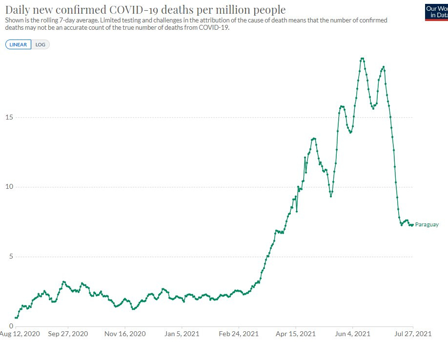
For more than a week I poured through national data from scores of nations, and even individual states. I saw the same spike in CFR over and over and over again---perhaps around 85% of the time. Among the remaining nations that did not show the CFR bump, there was often a massive case and death spike. For instance, Paraguay began mass vaccination on February 21.
Finally, I decided to look for a way to aggregate the bigger picture. I took the entire Our World in Data dataset from their github repository and coded up new columns to signal vaccination start dates for all nations. I created a relative start date of 0 for that date, and wrote up logic to sum across all European nations (nations with health care systems most technologically similar to that of the U.S.) in order to generate a pan-European lagged and smoothed CFR. I then normalized those CFRs to the Day 0 CFR, resulting in the chart at the top of this article. I then backed out excess deaths as a proportion of the excess CFR. While such computations may begin to include some clutter in case totals after the first 18 days, such clutter would result in a slight underestimate of the presumed vaccine-induced death total.

The result: 17,390 estimated vaccine-induced deaths, computed as the proportion of excess CFR above the normalized 1. This represents 1,018 deaths per million doses used during the first 30 days of those national vaccination programs.
Now, do I believe that the vaccine kill 1 out of every thousand recipients? No. I suspect that this is a ceiling for the actual impact. It makes sense that the first 30 days of mass vaccination skewed toward high risk groups. While I have not yet done enough research to crunch the relative risks among those vaccinated during the first 30 days of vaccine rollouts compared to the general population, my eyeballing of VAERS data progressions makes me think the 1,018 deaths per million is likely overstated by a factor of 2 to 5.

This means that the experimental COVID-19 vaccination programs may be killing somewhere between 200 people per million doses and 500 people per million doses---perhaps even more since the U.S. has a more substantial population living with substantial comorbidities, and the world's best cardiac trauma care. At 360 million doses delivered, these estimates suggest between 72,000 and 180,000 (or maybe even a little more) vaccine-induced deaths in the U.S. during the experimental COVID-19 vaccination program. As we will see in future articles, this estimate range matches numerous other mortality signals.
How Could These Deaths Go Unnoticed?
Consider the possibility that 120,000 Americans have been killed by vaccines. Suppose that half of those deaths were in nursing homes (as with COVID) and were all labeled COVID deaths, which would have surprised nobody during the harsh winter COVID wave. The remaining 60,000 were mostly elderly, skewed toward minorities (Native Americans and Mexican Americans in particular), and, as with COVID, often coincided with comorbidities. What is a 1 in 3,000 chance of dying from an injection might look like a 1 in 25,000 or even a 1 in 50,000 chance of dying in many family communities. A hospital that tells you, "We just aren't seeing that," might be completely honest even as the problem truly exists!
Even worse---the vaccine deaths you might have heard about may have traveled through your grapevine as "COVID deaths", so the signals you might expect, and might still be nonexistent for a majority of Americans, might be mostly invisible according to assumed description.
Meanwhile, vaccine trials, which still haven't released their raw data, seem a little rigged, and reported lopsided exclusions that could hide some serious problems, are certainly not well enough powered to detect the problem, despite what some narcissistic biostatistics professor might tell you.
Most people do not handle large numbers well. For instance, people who have an easy time imagining what the difference between $20 and $200 in their wallet might look like lose all conception of the difference between $2 million and $2 billion in wealth. Similarly, most people have a really hard time with tiny numbers, too. And 1/25,000 and 1/50,000 are pretty tiny. Heck, even 1/3000 is small enough that the CDC couldn't recognize that level of incidence of myocarditis among young males---even with Israel pointing right at it for eight full weeks.
To Be Continued...
Australia makes for an interesting study - look at the charts here (click 'Tap to know more' for Australia): https://graphics.reuters.com/world-coronavirus-tracker-and-maps/vaccination-rollout-and-access/
They had no Covid in the community and minimal vaccination until around June, when the rollout picked up speed. Record spikes in Covid infection rates have followed in July and August.
Skilled contact tracers, previously with a perfect record of being able to identify and stop trains of transmission, are suddenly unable to identify the source of infection for the majority of cases. It implies they are overlooking something fundamental.
Regarding what you wrote here:
"Since the vaccination programs targeted those at highest risk of COVID first (and VAERS and similar databases show similar age demographic skews in mortality reports), it makes sense that we would see a substantial and measurable proportion of vaccine-induced deaths early on during vaccination programs."
Were you able to analyze any of the data broken down by age group? So for example it would be very interesting to see a chart showing both the deaths among the elderly age bracket and doses given to that same age bracket, for each time period (say, month). If the vaccines were causing excess deaths then a chart like that would make that much clearer.