Other Vaccine Wars articles can be found here. The RTE Locals community is here.
Note: The second half of that title is my conclusion, not Clare Craig's, though I hope she'll recognize the obvious conclusion.
Over the past couple of days, Clare Craig posted analysis of COVID-19 data from U.S. states. I don't think she realized, yet, that her observations affirm my prior analysis showing there is zero (negative really) vaccine effectiveness masked by an illusion of Healthy User Bias (HUB).
Clare posted a number of interesting graphs, and made multiple interesting observations that are not consistent with many models of what took place, but are perfectly consistent with my observations about HUB driving the new mortality trends. I'll explain these points as I go.
Yes, HUB is At Play
I was surprised that Craig considered the possibility that "hot lots" affected the trends (which would imply a high correlation between batches and state destinations that does not look like any of the data I've seen), but did not consider HUB. After all, Craig was one of the few people working on COVID-19 data who highlighted the work I did demonstrated how HUB dominated the U.S. data.
Craig correctly notes that these graphs fly in the face of any claim of vaccine (or "vaccine") effectiveness.
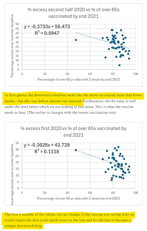
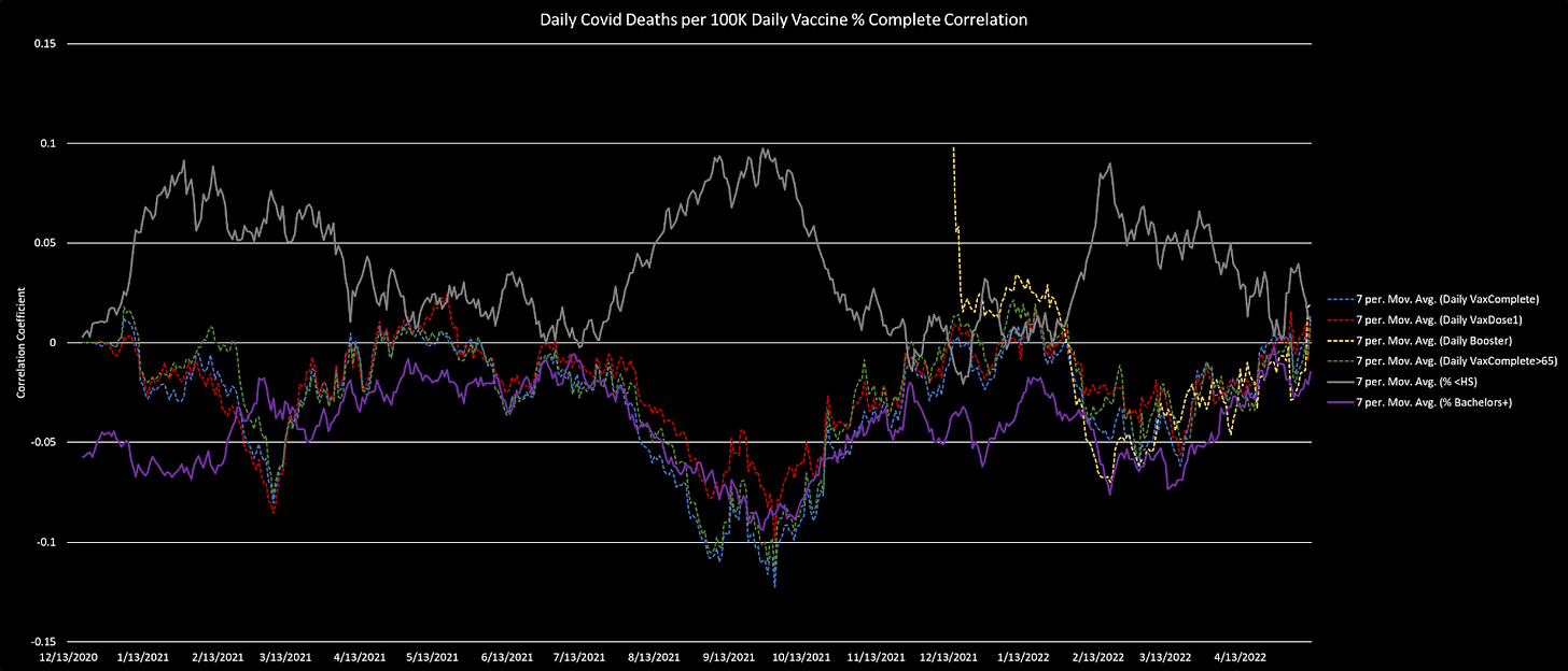
This is precisely the point that I made in my reanalysis of the Society of Actuaries data. I pointed out the obvious Simpson's paradox the actuaries…uh, accidentally missed? A (state) regional correction alone reversed most of the downward case trend (by vaccination status), but there is even more HUB we can correct for when we dig more granularly into the county-level data. This fully flattens the supposedly downward trends:
The COVID-19 trends consistently conformed with health/wealth/education statistics per county.
Craig is welcome to my county level database. Sadly, when I tried to recreate the updated database, I found that the NYT data source stopped publishing and with so many projects I did not have time to find a replacement. Sigh.
Flattened or Reversed Trends?
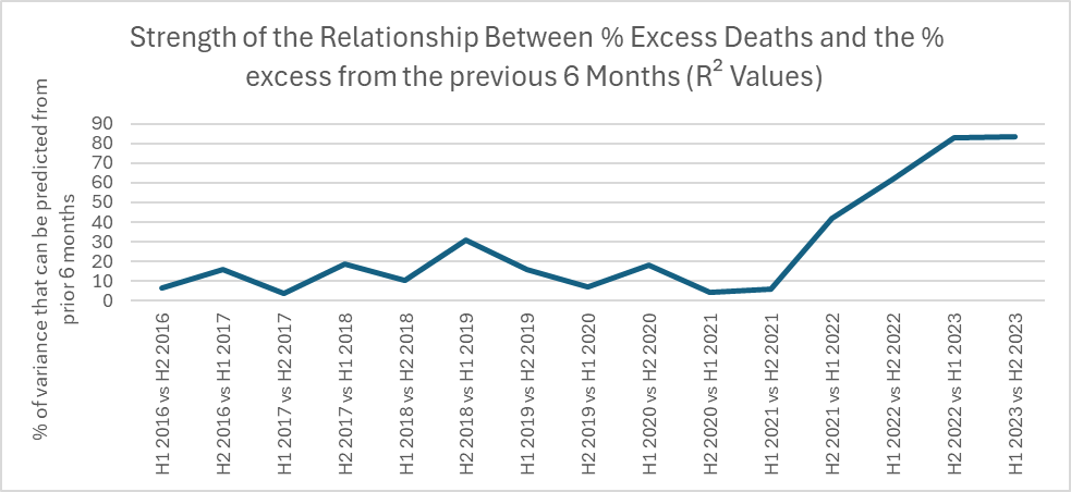
What Craig found in the data that shocked her is that ongoing excess mortality is "well-sorted" among states. What I mean by that is that when six-month mortality totals are compared by state, the rankings remain highly similar, even though it wasn't that way prior to the plandemonium. Once the vaccines were rolled out, the relationship got tighter and tighter and tighter.
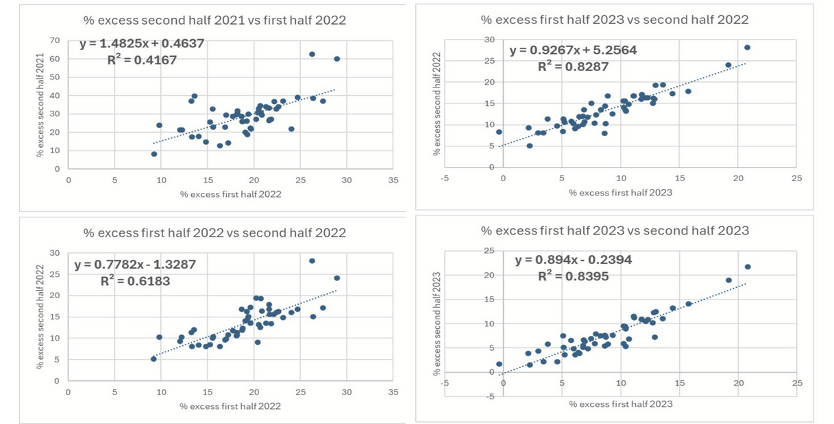
Those who still believe that the Society of Actuaries was playing with a full deck when they suggested their observed data trends spoke of vaccine effectiveness must now explain why those same states are doing better now that recorded COVID-19 mortality and vaccine uptake are both nearly nonexistent! Is there anyone with data suggestive that these deaths are downstream effects of COVID-19 cases?
On the other hand, as I've talked with data-minded folks about my analyses, open-minded people have asked me why we aren't seeing flattening of the HUB model if the vaccines are causing some of the excess mortality. My answer is that the rest of the excess mortality correlates oppositely to vaccines with respect to HUB. What I summarize as "deaths of despair" (DOD), which includes drugs and alcohol abuse, as well as suicide, cluster more in less wealthy/healthy counties. See (Fink, Schleimer, Keyes, et al, 2024) (Kuo and Kawachi, 2023).
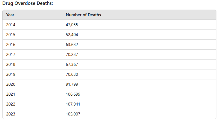
Since DOD climbed rapidly since 2019, at weirdly almost exactly the same rate as all other causes of excess mortality, and the correlations with health/wealth are even stronger than HUB vaccination correlation, they nearly perfectly offset the relative increased vaccine-associated mortality experienced more in healthy/wealthy counties/states. The two new causes of mortality together (DOD + vaccines) are large enough weights (proportions of all cause mortality) that they overtake pre-existing causes that relate more stochastically, and thus they dominate the sorting process. If you take two normal distributions, and scale each mean by X% without changing the absolute standard deviation and variance, they will necessarily rank in the same order a higher percentage of the time. That's precisely what happened.
This explains Craig's observation of the shockingly sudden well-sorting of state-level mortality rate rankings.
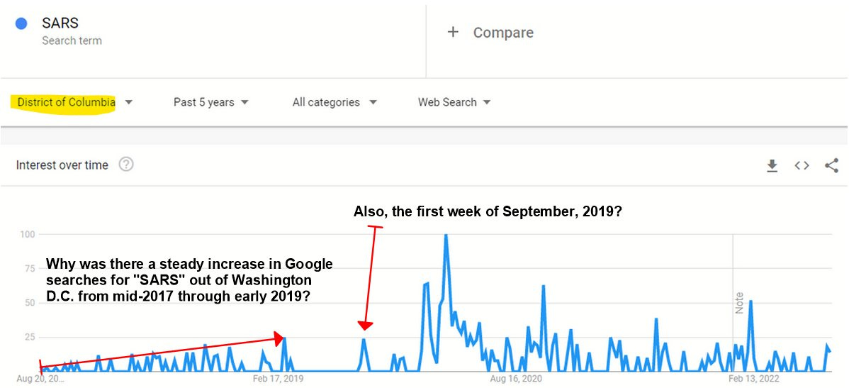
We should at this point be wondering if social engineers (eugenicists with situational allies in the budget offices) sculpted the whole process this way. Out of all the signs of pandemic prescience, one of them predicted Craig's last observation.
Craig noted that the safest places to be are Washington D.C. (where the politicians work) and Massachusetts (where the genetic engineers work).
Huh.
Remember to share this post. I’ve been depersoned by a large portion of the supposed dissidents pushing back at lies about the experimental mass “vaccination” campaign, so you have to participate in promoting good discussions about data over the carnival barkers.


Funny, Kirsch called me today asking about Eudravigilance data, I though he would have been all over that data when Wouter Aukema of Netherlands scraped down the raw data back in ~May.
I made a dashboard from part of the EduraV data and found so much bullshit, just like VAERS, hidden deaths, under-coding, etc...: https://www.vaersaware.com/eudravigilance I'm still waiting for my VSRF interview, I've been a frontline fly on the wall as much as anybody. lol
I don't think this movement likes true proud antivaxxers... just anti this vax?
Good stuff Mathew! I still like you. lol Hang in there. In my simpleton mind I think it was a "paper" plandemic and vax carnage cover-up. At both ends data I believe data was curated "on paper" to look like a virus was ripping through the world in the beginning, then hiding and obfuscating the vaccine carnage "on paper" on the other end.