Articles from the Vaccine Wars can be found here, including the first six articles of this series.
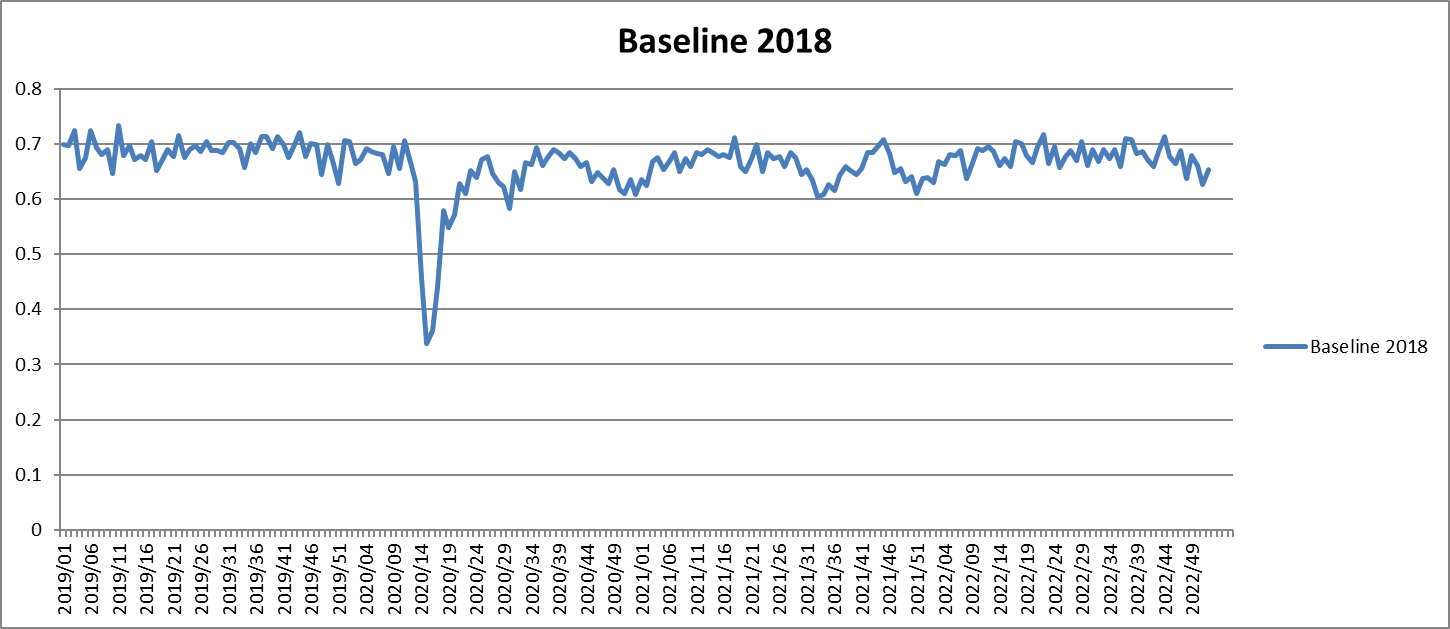
The chart above shows the weekly county mortality rates for 2019-2022 correlated with the same-week mortality rates from 2018. Through early 2020, the correlations hover around 0.68, with a bit of noise. The correlation breaks down when COVID first hits the U.S., concentrated in the Northeast. But after that, the correlations return almost entirely to normal, with perhaps a little more noise before that begins to settle in 2022.
On its own, this correlation chart does not mean much, but the following charts finish an important story. I wanted to find more ways to test my hypothesis that all apparent efficacy of the COVID-19 vaccines found at county level data in the U.S. is due to the Healthy User Bias (HUB). In prior articles, I looked at COVID mortality more specifically, but this time I'm looking at all-cause mortality (ACM) as others have. There is no one perfect metric to examine. It's best to examine all angles, so COVID deaths and ACM should both be part of a complete analysis.
One way to normalize ACM is to divide the mortality for each U.S. county from 2019 through 2022 by the same-county mortality from 2018. This reduces each quantity to a ratio that I'll call the ACMR. If I am right that the vaccines made no difference, then these ratios should be relatively similar across counties. In that case, vaccine status should have essentially no correlation with those ACMRs.
BOOM!
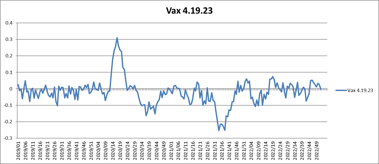
From the time that vaccines are rolled out, there is a brief span during 2021 Q3 when vaccine uptake shows negative correlation with the ACMR, suggestive of at least some vaccine effectiveness (VE). However, as I pointed out in my re-evaluation of the Society of Actuaries report last year, this appears to be mean-reversion from the first COVID-19 wave. More people died in the counties with higher vaccination rates before vaccine rollout, so there were fewer [elderly in particular] at high risk of dying later on.
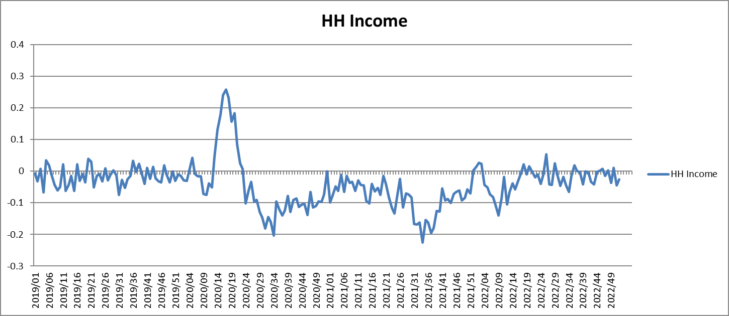
Put simple: This graph fits perfectly with the hypothesis that all apparent VE is simply HUB. But we can check the Healthy User Bias (HUB) against the Wealthy User Bias (WUB), which should look highly similar under my model, to see if the results look different. They do not.
In the U.S., ACM increased by around 15% once COVID-19 hit, but that increase is relatively evenly spread across counties, regardless of relative vaccination status. What appears to be some positive VE during the "delta wave" is entirely predicted by median household income.
Laying Out the Complete Set of Arguments
Due to a large pile of priorities, the articles in this series are not my best writing. However, they are a great start to a complete argument. And I'm finding additional ways to examine the data, and simpler ways to explain some of it for the average reader.
I am also becoming better acquainted with the full array of writing and arguments from Team Fenton's group regarding misclassification of vaccine status, and I have a few of my own observations in that regard. I have begun to work on a book, The Efficacy Illusion, with the following outline:
Part I: The Illusionists' Tool Kit (Single Chapter)
An up front outline of the arguments.
Part II: Controlling the Data
Controlling Data Access
Controlling the Trial Data
Miscategorization of Vaccination Status
Reliance on Uncorrected Bias
Part III: The Healthy User Bias
What is the Healthy User Bias (HUB)?
The Challenge of Quantifying the HUB
A Brief History of the HUB
Vaccine Cards: Profoundly Unconfounding
A Brief History of the Vaccine Safety Datalink: A Profoundly Confounded System
Evidence of the HUB and the Zero Efficacy Hypothesis for COVID-19 Vaccines
How Does the HUB Get Missed?
Engineering the HUB
Part IV: Psychological Sleight of Hand
Parasocial Hacking
The Asch Trident
Nudge Units
Part V: Questioning the Answers
One or several chapters?
Part VI: Where Do We Go From Here
I have twice begun working on books since mid-2020. One was nearly complete before I started publishing chapters here at RTE, free for the public to consume. The other I toyed with, but never found the time to put energy into it. This one is perhaps at a point of three-quarters of a first draft. Comments are welcome.


Mathew, sorry I am a bit confused, would you say this also means that the vaccines did not kill many people? I heard about estimates of 1 death per 1000 doses. Or Joel Smalley said the vaccines killed more than 10 million worldwide. Do you think the vaccines had simply zero effect with regard to ACM, which also means they neither saved nor killed many people?
That book sounds like essential reading - thank you for making the effort.
Can you add some graphs to this piece by medium and low income to make the point more clearly please? I am assuming that the apparent efficacy wanes with falling income?