San Diego County Data Busts a Hole in Vaccine Efficacy Narrative
The Vaccine Wars Part L (That's "50" in Dweebspeak)
Up front: I thought I was taking a brief break from my analysis, but the following exploration took some major and minor twists, with some revealing information along the way. It will necessarily slow down my analysis, but may also reveal a level of statistical corruption at the CDC.
This article was borne out of the analysis that I began discussing here and here on wealth effects in vaccine efficacy (VE) rates.
While taking a break from my current analysis on U.S. county data, a Justin Hart tweet caught my eye.


Having lived in San Diego County for more than four years, I got curious enough to dig just a little, so I followed the link Justin provided for the data in a follow-up tweet.
So, I wondered, "What do the vaccination rates look like?"
Well, I have that in the CDC data set I'm working with.
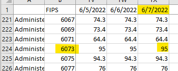
Okay, FIP code 6073…
Wow. According to the CDC, San Diego County hit a 99.9% vaccination rate on October 7, 2021.
Really?!
Wait, what's this?
On December 9, 2021, the percentage of those vaccinated fell down to 95%. (I'll talk about what actually happened later in the article, but I like to present my chain of reasoning and actions for educational purposes.)
Okay, is this like vaccines being approved for kids? If so, why don't the numbers change for all the other counties? Also, why then did that number never change over the next six months?
Okay, now let's look back at San Diego's own report to see if we can make sense of this.
The report has this nice map with percentages of fully vaccinated residents, and I've been looking at single dose CDC data, but I doubt they can be reasonably matched. But I'll go take a look at the All_VaxComplete tab of my spreadsheet…
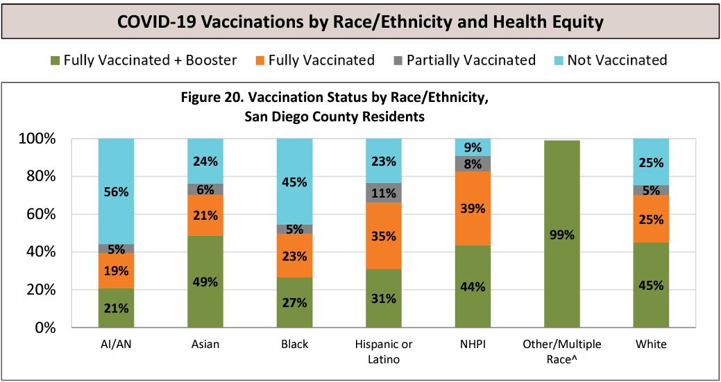
If the areas on the map in dark…red? Is this one of those crayons like burnt cienna? I'll call it red…if the areas marked red in the map have most all the population (they don't, really) and high vaccination rates, then maybe the CDC's June 7 numbers are correct? But that would mean that 18.4% of county residents stopped at one vaccine dose, which would be a higher proportion than I've seen in any statistics anywhere.
Fortunately, the report contains that information:
No racial group stopped at one dose at a percentage higher than 11%, and the aggregate looks to be 6 or 7 percent. And the light blue (unvaccinated) looks to me like it averages around 25% (well over 90% of San Diego is White, Hispanic, or Asian).
I'm trying my best to excuse or to steelman the CDC's data here, but I keep running into brick walls.
Is fraud too strong of a word?
I feel (at this point) like the CDC data has likely embedded data series (I doubt San Diego is the only case, and I plan to look for others) that are simply fraudulent. (Note: I later figured out what is likely going on, but I'll explain that later.)
Recall back in April when I pointed out the absurdity of Heather Scobie's data presentation that made the vaccines look extremely effective, but pulled data from just 26 U.S. jurisdictions. Why would the CDC, with its immense pile of data, ever want to run any calculation from a small fraction of a percent of the U.S. population? Not using a large data set (and keeping obscure the nature of the data being used) reduces their credibility in my eyes to essentially zero.
Understand that San Diego is an extremely healthy city. In the early morning hours there are trillions of people jogging on the beach or riding their bicycle up into the mountains in the eastern part of the county. You don't see as much fast food. The city attracts a lot of wealthy or wealthy-ish 20-somethings who want to live somewhere amazing before moving on. Also, the long-term population includes a lot of the kinds of Christians who stay for generations raising healthy families. The transient 20-somethings may never figure this out while jogging the beach, dining at sushi hubs, or working from their laptops.
The reason that I mention all of this is that if my job were to fudge the statistics of just a few counties in the U.S. in order to put together reports that make the vaccines look 95% effective, San Diego is the first large metropolitan center that would come to mind. Sure, I might think about one of the Pacific Northwest cities or Salt Lake City (none of which I know as well as San Diego), but San Diego would be a great choice to falsify.
Reducing the unvaccinated population to a small percentage amplifies/elevates the mortality rate of that population by a lot.
The CDC can apparently pass us graphs and charts based on tiny subsets of their data with a straight face. It only takes a small number of localities to fudge a lot of results at once.
It's in CA, so the fraudulent data might be more easily overlooked by a lot of Americans. ("Oh, they just love their vaccines in California," which is less true in some places than you might think.)
(Speculative) Living in San Diego is expensive, so people work hard, so not as many people there are spending their free time getting on line to compare county reports with CDC statistics?
San Diego County Data and The Zero Efficacy Hypothesis
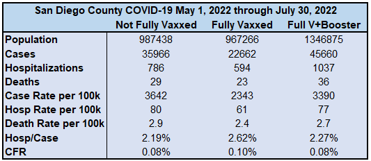
All this said, I noted that San Diego excluded the column for "unvaccinated" in the first image I posted. The unvaccinated were weirdly grouped into the "not fully vaccinated" category. Regardless, the proportions of deaths in the categories that they chose to display are all almost identical to the proportions of the populations those groups represent, indicating almost precisely zero vaccine efficacy. I wanted to find a way to compute the VE, to be certain, and after hunting through the San Diego County document, I found the most direct way to do that.
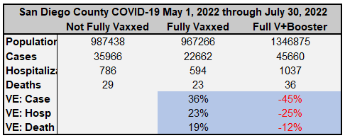
With tiny estimations due to rounding, I was able to determine the approximate number of people in each category, and thus compute some relevant VE statistics.
Understand that since there is no unvaccinated category in their statistics, I am unable to perform a complete VE analysis, even for an aggregate that would inappropriately group age groups together (creating a Simpson's paradox). Even grouping the unvaccinated and the single-dosed together likely increases the risk metrics because those who stopped at one dose are likely largely those who had concerning reactions to the quasi-vaccines. I personally suspect very strongly that the unvaccinated stats would be the lowest risk in most ways, if we could separate that out. This opinion comes from having seen "waning efficacy" stats showing single-dosed individuals doing worse and worse over time. These are the people whose health has already taken a hit from taking a single dose of one of the mRNA transfection agents.
However, there is a LOT that we can see:
We are clearly and absolutely not in a "pandemic of the unvaccinated".
The primary risk statistics are fairly flat. There is no indication of substantial leaps in efficacy from one group to the next.
The up-and-down VE is highly suggestive of a statistical sieve that, when removed, looks to average out to zero efficacy.
The positive VE ascribed to being fully vaccinated is NOT with respect to the unvaccinated. It is with respect to a group that includes them. There may still be zero or negative VE versus the unvaccinated group.
Getting to the level of Fully vaccinated does NOT confer more VE for severe cases as we have been told. On the other hand, the negative VE for the boosted is MORE pronounced for cases. Why would getting one more dose increase the average severity per case one time, then decrease the average severity per case the next time? It doesn't make sense unless there is a statistical sieve at play, and in turn this supports the Zero Efficacy Hypothesis.
To the extent that there is modest efficacy in some of the stat lines, we see from the previous chart that the most healthy San Diegans are lumped more into the most vaccinated groups, while the least healthy are lumped into the least vaccinated groups. This confers a confounding advantage to the more vaccinated groups.
Boosters are a disaster. Not only are disease rates and mortality higher, but these are people subjecting themselves an additional time to adverse events, which seem to have a dose dependent relationship (more LNPs or more mRNA are doing worse damage due to either pathological priming or toxic buildup or prions or…).
Edit (major): (h/t Mark Reeder) The asterisk* on the "Not Fully Vaccinated" group INCLUDES people of unknown vaccination status. This puts the most troubling people to keep track of (which probably correlates to health) into the "0 to 1 dose" group as I calculated VE. But if a portion of these people get pulled into the other categories, it changes the computations. And if Dr. Kory is right, this will further drag down VE numbers.
Steve Kirsch might say, "This proves the vaccines aren't working, and you're afraid to debate me about it."
Toss another log on the fire.
Also understand that this is just COVID data, and does not tell us the full risk-benefit picture of efficacy at keeping people healthy or out of the hospital. Ahem,
Back to the CDC Data Problems
Since I wasn't the one who put the U.S. County data set together, I hadn't properly read the data definitions, yet. Shame on me. I should have done that from the start, even though the data set was handed to me (mea culpa). But perhaps I needed to see these data inconsistencies to understand what was going on, anyhow. Laying eyes on the San Diego County forced my eyes open a little wider.
If you're confused at this point, I understand, and I'll explain why. From the CDC Data Definitions, emphasis mine:
CDC estimates the number of people receiving at least one dose, the number of people who are fully vaccinated, and the number of people with booster doses. CDC estimates are based on data that include a dose number (first, second, boosters, or additional dose). To protect the privacy of vaccine recipients, CDC receives data without any personally identifiable information (deidentified data). Each jurisdiction or provider uses a unique person identifier to link records within their own systems. However, CDC cannot use the unique person identifier to identify individual people by name.
There are challenges in linking records when someone receives vaccine doses in different jurisdictions or from different providers. That person could receive different unique person identifiers for different doses. CDC may not be able to link multiple unique person identifiers for different jurisdictions or providers to a single person, and subsequent doses may appear to be a first dose when reported. Thus, CDC’s data may over-estimate first doses and under-estimate subsequent doses.
Another issue that poses challenges to estimating doses administered is that different jurisdictions and providers use different reporting practices. As people receiving doses are attributed to the jurisdiction in which they reside, the reporting method might change between doses if they move to a different jurisdiction. Also, CDC may lack information about a person’s residence. These issues can cause CDC’s dose number estimates to differ from those reported by jurisdictions and federal entities.
CDC has capped estimates of vaccination coverage shown on COVID Data Tracker at 95%. This cap helps address potential over-estimates of vaccination coverage due to first, second, and booster doses that were not linked. Other reasons for overestimates include census denominator data not including part-time residents or potential data reporting errors. Previously, CDC had capped estimates of vaccination coverage at 99.9%. CDC changed the cap to 95% on December 9, 2021, to account for differences in the accuracy of vaccination coverage estimates between different jurisdictions.
Here is how the magic trick works:
Step 1: The CDC is modeling the data, but telling us "data" instead of "modeled data" or "estimated data" up front. Their excuses for the modeling may be more or less reasonable. However, what is not reasonable is to have no feedback loop showing how accurate their predictions are relative to the reports coming in from various jurisdictions. Fun fact: That is, in actuality, what a p-value is actually meant to tell us—the p-values should be randomly distributed on the interval [0,1] (meaning between 0 and 1, inclusive) if the modeled distribution does in fact match the actual distribution. It's like public health uses p-values to mean anything they want except for what they're actually supposed to mean.
Step 2: Report that there is a "pandemic of the unvaccinated". This sends the partisans into a frenzy, further putting pressure on those being squeezed by vaccine mandates in the middle of 2021. Admit that the data comes from only a subset of the data from a subset of states, but don't talk at all about the data modeling. The legacy media will only cover (or at least repeat ad nauseum) the catchphrase. CDC officials probably think they're ass covering this way, but it's a sin of omission that cannot be overlooked.
Step 3: Keep changing the model, which is a blackbox, anyhow. After all, there are too few of us performing data investigations, untangling all of these knots. By the time anyone figures it out, we're in a different Plandemonium Epoch.
Unleash Putin's forces in Ukraine, get the partisans flying Ukrainian flags on the social media icons, and don't breathe a word about Western corporations and wealth funds having bought up 17 million hectares of farmland in Ukraine, just prior to the tenants are murdered or pushed off by military action. The biolab shenanigans will keep most of the conspiracy theorists busy, anyhow. Uri Geller will entertain the rest.
Offer the Pelosi Sacrifice to the CCP! Or whatever is going on there. There where most of the world's semiconductor supply is produced. Might she really be sent to build a strong image ahead of assuming the presidency?! Is that really the baseline of the Democratic Party, now?
Remember that both of these "takeovers" were being "advertised" in media outlets years before the plandemonium began.
Step 4: Admit to the New York Times (February 22, 2022) that not all the data is being used. The opposition will rest, thinking that's the whole story. It's a great way to stop a real data investigation. Something like that almost worked with the DMED data.
Meanwhile, I now have to think about how to use the CDC data. I may produce an analysis knowing that the modeled data is false. I may hunt for counties with capped totals, and run two more analyses based on these subgroups to see if they match each other and the first. I may also go hunting for other instances where the data does not match local epidemiologist reports.


1. Yes, you do certainly deserve a rest!
2. No, the CDC's explanation for modelling the data due to privacy concerns is not "reasonable" in the slightest when the lowest ranked airport, bar and restaurant staff are entitled to know your same vax status on demand. Fortunately, enough of us can not only see their lies but have the courage to reveal them to others.
"To the extent that there is modest efficacy in some of the stat lines, we see from the previous chart that the most healthy San Diegans are lumped more into the most vaccinated groups, while the least healthy are lumped into the least vaccinated groups. This confers a confounding advantage to the more vaccinated groups."
To supporting your point, I have updated my recent post with a graph for CA specifically showing CA counties with higher vax rates are richer, smoke less, less obese, have longer life expectancy, lower death rates, and are more physically active. I don't think it is too big of a leap to expect the vaccinated and unvaccinated populations within a county to exhibit those characteristics.
https://inumero.substack.com/p/we-dont-know-if-covid-vaccinations