“He can be made to take a positive pleasure in the perception that the two sides of his life are inconsistent... by exploiting his vanity. He can... enjoy kneeling beside the grocer on Sunday just because he remembers that the grocer could not possibly understand the urbane and mocking world which he inhabited on Saturday evening; and contrariwise, to enjoy the bawdy and blasphemy over the coffee with these admirable friends all the more because he is aware of a "deeper," "spiritual" world within him which they can not understand. You see the idea - the worldly friends touch him on one side and the grocer on the other, and he is the complete, balanced, complex man who sees round them all. Thus, while being permanently treacherous to at least two sets of people, he will feel, instead of shame, a continual under-current of self-satisfaction... and that to cease to do so would be "priggish," "intolerant," and... "Puritanical.” -C.S. Lewis, The Screwtape Letters
All data sources shared at the end of the article.
We are told a tale of vaccines with stunning efficacy that wanes over time. Apparently they all work like this, or the ones made by the cool kids do, and while they can be designed over a weekend (at not just one company…but two…both Moderna and Pfizer vaccines share that fantastical tale) nobody wonders if a few extra days might result in consistent efficacy or improvements.
Huh.
If you haven't already smelled bullshit, I have graphs that cure anosmia.
First, the Big Picture
"Bottomless wonders spring from simple rules, which are repeated without end." -Benoit Mandelbrot
Since the mass experimental vaccination campaigns began, COVID-19 cases and deaths exploded across most nations and all continents, and no matter how you ran the correlation data through November, it was not suggestive of vaccine efficacy.
The nature of correlations are at least somewhat scale invariant. If the vaccines are effective, we should see negative correlations between vaccination rates and COVID-19 deaths among population units of most any size—and even when the sizes of the populations are not the same.
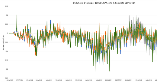
Next: Whether you consider the U.S. the most advanced nation in handling data (true) or the most cleverly corrupt nation in the world (also true) and decide which switch to flip to guide your biases, we can at least agree that the data is the data. The following chart represents daily measured correlations of vaccine uptake and COVID-19 fatalities by county across the whole of the U.S.
What do we see?
The daily correlations do not present particularly strong correlations whatsoever, but they are slightly negative on the whole. Maybe vaccine efficacy was always overstated? It's not like we have trial data, yet, or that we even know whether it's real, yet.
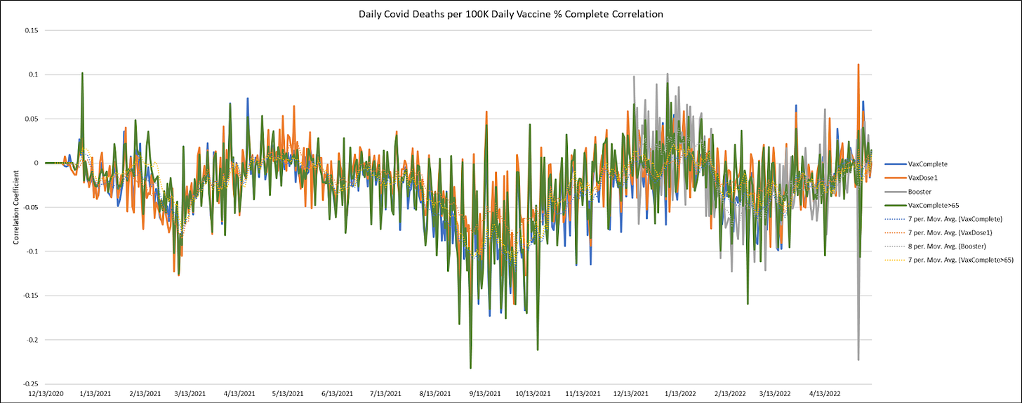
Let's take a second, less noisy look at just the 7-day moving averages…
Actual, real data sort of gets me in a mood.
The Good, the Bad, and the Ugly
"Whoever has the most liquor to get the soldiers drunk and send them to be slaughtered—he's the winner." -Union Captain, The Good, the Bad, and the Ugly
The Good?
At least we don't see the substantially positive correlations between vaccine uptake and COVID-19 death that we see globally.
The Bad?
There isn't a whole lot of negative correlation that we should expect from vaccines with such amazing efficacy that we should force them on our troops and children (WHO DON'T DIE FROM COVID any more than from shark attacks or lightning strikes, and maybe less) and working age population.
The Ugly
There is almost no difference in these correlations with COVID-19 death whether we look at rates of one, two, or more doses, and what little difference there is could be survivorship bias or other factors (some of which I will explore in a future article).
The "waning efficacy" story is sort-of-kind-of there if you want to believe that efficacy happened gradually, and then very suddenly vanished in a V-shaped sort of way.
We see zero correlation during the omicron wave…but that's where the data was already heading. I'm not sure what to make of that, but it ain't natural. I blame interdimensional shapeshifting reptilians for any confusion.
Now, let's really rock n' roll.
What Does the State Level Data Say?
Let's zoom in on this fractal. Surely we're going to see self-similarity, right?
I wasn't certain how I wanted to organize and order the states.
By region? Maybe weather matters?
How much does size matter?
How much does Cuomo matter?
To keep things simple enough, let's focus on correlations with the "fully vaccinated".
I'm going to start with the states with the largest populations. These should theoretically already look the most like the big fractal. Apologies that these charts are not as nicely presented as some. Cramming scores of charts into a spreadsheet and thousands into a series of spreadsheets gets cumbersome.
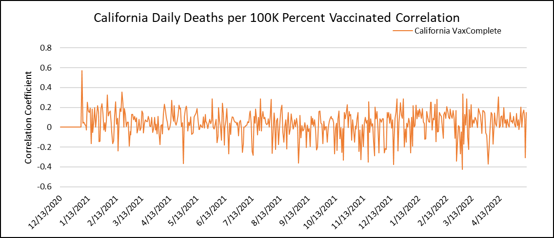
Here, the correlations are daily death rates versus cumulative fully quasi-vaccinated serfs.
Yikes! This just looks like noise. It's almost like the vaccines have no efficacy in California. How about Texas?
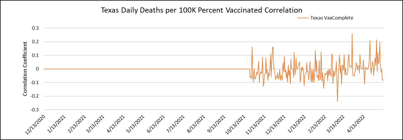
Sorry, the CDC wasn't on the ball with TX until late in 2021. But what we see since the data rolled in is more noise.
How about Florida?
Similarly, we have a partial data set, but no evidence of efficacy.
So, where does the slightly negative correlation come from in the national data?
Good question. We're getting there…
There we go! In New York, where Cuomo served (or "served"), which is generally known as the shining example of honesty in American politics and all else related to honesty in big industries, we see a couple of waves of apparent vaccine efficacy.
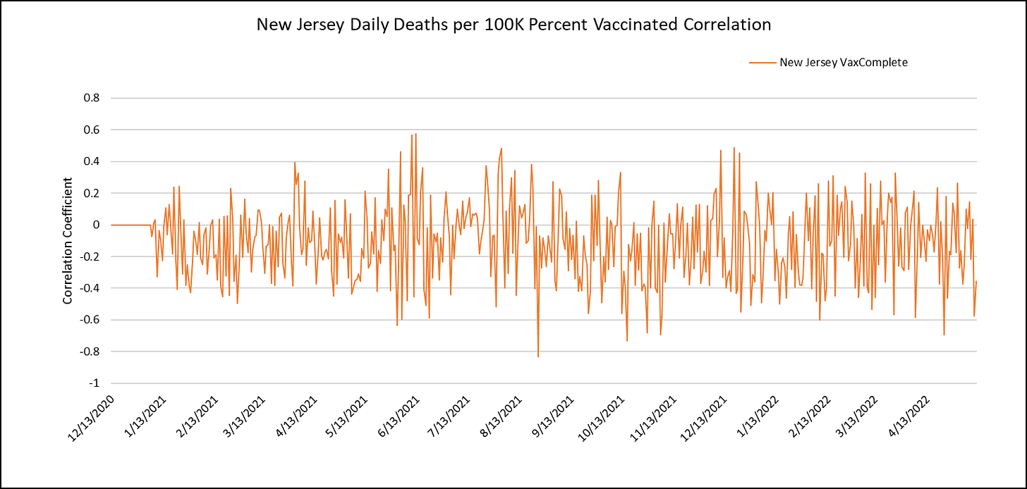
Just across the border in New Jersey (a.k.a. "Still New York"), we see our first example of consistent, but mildly negative correlation between vaccine uptake and COVID-19 mortality by county.
It's weird that none of these state results look alike.
You ain't seen nothin' yet!
Quibble with my regional grouping if you like (yawn), but here goes…
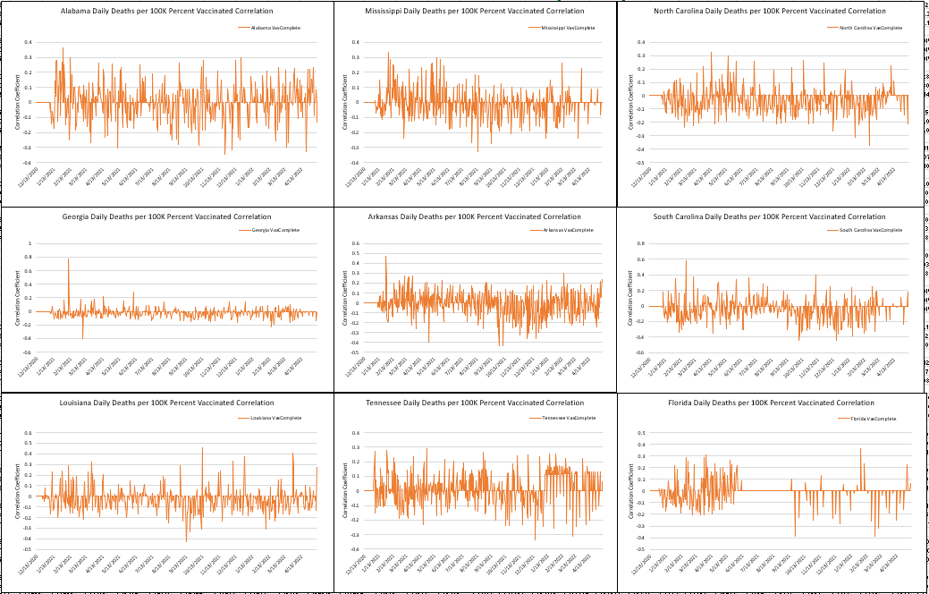
The Southeastern States
Looks like a lot of noise hovering around zero correlation. If you squint, you can see slightly negative correlation in David Rockefeller's Arkansas, Ralph Baric's North Carolina, and Robert Bird's South Carolina.
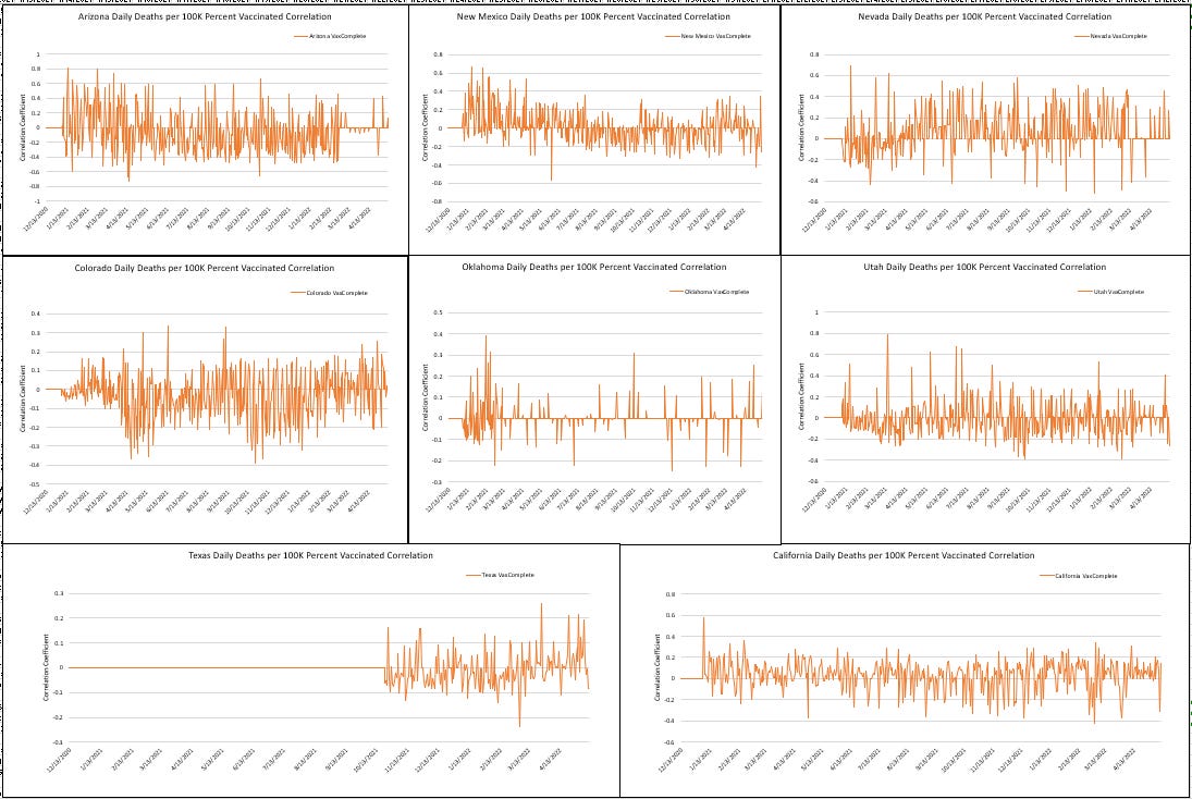
The Southwestern States
What we definitely don't see here is a "waning efficacy" story. We don't really see anything like "consistency" or "dramatic efficacy ever" either. In Utah where there are more anti-vaccine Mormons as a proportion of the population, we see the very definition of statistical noise. New Mexico looks like…unwaning?
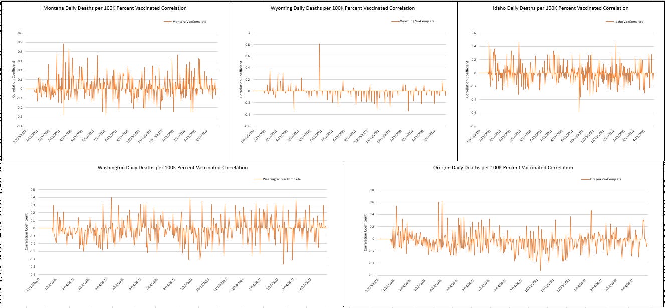
The Northwestern States
Let us for the moment agree not debate the existence of Montana (I give Montana a 65% chance of being real), or the fate of Greater Idaho.
Not much to see here. Maybe a tiny sliver of negative efficacy in the region that somewhat fits the national trend, mostly stemming from Bill Gate's state of Washington and Oregon, whose state motto was rumored to be changed to "the tolerated domestic terrorism state".
Mostly Irrelevant Flyover States
Sometimes called "the Midwest", which I still remember because I went to college there and learnt that.
Sorry for the tight squeeze. I blame it on the big hearts of the people who live there, which are even larger since some of them received mRNA jabs.
Not a lot of consistency here. Ohio has a weird progression where the vaccines had "reverse waning efficacy" or something like that. Michigan made the vaccines look "sort of kind of okay" for a few months. Minnesota and Illinois, which are definitely the least politically corrupt states in the Midwest, show moderately negative correlation, most of the time. It looks like people in Nebraska and Missouri would have been better off dodging the quasi-vaccines.
The American Northeast
I refuse to do a "New England" section on account of the lack of a new royal family.
This is the most efficacy-feigning region so far. Of course, this is where a lot of the states like Vermont were that claimed to have vaccinated 99.999999% of their elderly populations when that wasn't really true, so it's hard to fully trust the data. They also forgot to fix the data to make the vaccines look less effective against omicron, which seemed to stand out in the entire rest of the universe.
States that Beg to Join Other Regions' Sport Conferences
I warned you about my classification system. Look, I had all these little pictures to deal with in one of dozens of spreadsheets. Also, Hawaii disappeared. It just vanished. Like it was swallowed by a volcano.
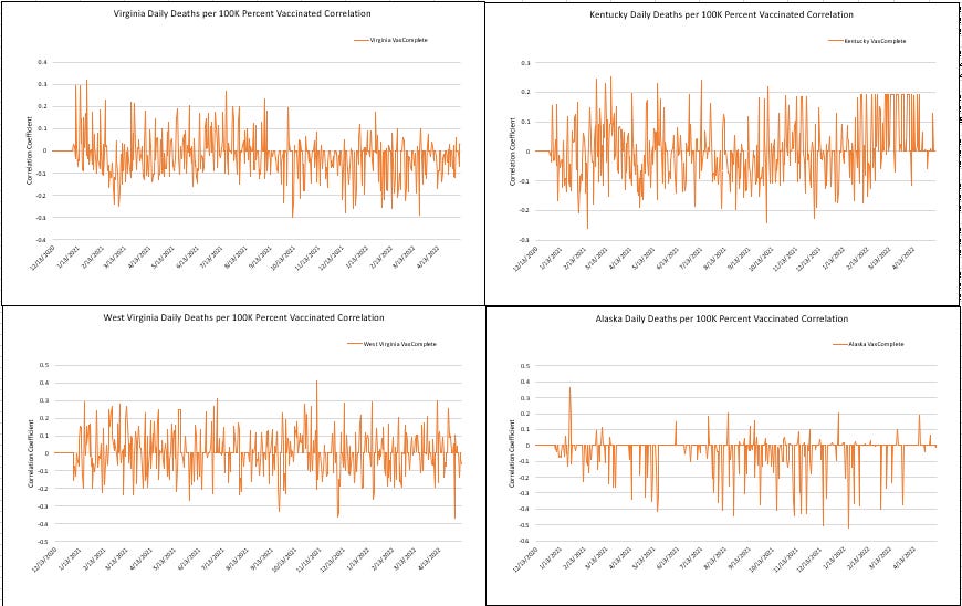
Virginia wasn't seeing much vaccine efficacy until it remembered how much money it gets from its Beltway connections. Just kidding? Otherwise, there is noise and there is Alaska, which is too small to make much of a dent in the national picture.
I don't see the self-similarity in the fractal. What gives?
What gives indeed.
That's it for Round 1 with this vast new dataset that's been cobbled together. Much more to come. I hope this has been helpful to some people. I mean...I know that there are plenty of people who just don't see much of a reason to care at all about COVID. Were it not for the impending authoritarianism, I wouldn't blame them.
Understand that an article like this involved dozens of hours of production. If you appreciate this work, please consider purchasing a paid subscription. And share the work widely.
Data Sources
If there are researchers who want to take up further study using this composition dataset, I will consider sharing the work done to make these resources composite. This will primarily apply to those I trust and have worked with, or whom I can judge to be solid researchers interested in making use of it.
COVID CASE AND DEATH DATA
Primary: NY Times dataset housed at https://raw.githubusercontent.com/nytimes/covid-19-data/master/us-counties.csv"
Note that the NY Times dataset lacks case and death data for New York City, some counties in Alaska and Missouri
Secondary: For counties missing in the NY Times dataset, data from the Johns Hopkins Covid dataset was used to supplement the NYT dataset
JHU dataset housed at https://raw.githubusercontent.com/CSSEGISandData/COVID-19/master/csse_covid_19_data/csse_covid_19_time_series/time_series_covid19_deaths_US.csv
COVID VACCINATION RATES
County level vaccination rates:
CDC dataset housed at https://data.cdc.gov/api/views/8xkx-amqh/rows.csv?accessType=DOWNLOAD
Note that CDC county level dataset does NOT include data for Hawaii. Could not find way to download Hawaii vaccination rate historical data from their state website.
Note that CDC county level dataset includes Texas vaccination rates from October 2021 onward ONLY. Will add in earlier Texas vaccination data at some point.
Note that CDC county level dataset is also lacking information for some small California counties
State level vaccination rates:
CDC dataset housed at "https://data.cdc.gov/api/views/unsk-b7fc/rows.csv?accessType=DOWNLOAD
Note Hawaii and Texas State Level data is available in this dataset
DEMOGRAPHIC DATA
Unemployment Rates, Median Household Income, Median HH Income % by State
from https://www.bea.gov/data/income-saving/personal-income-county-metro-and-other-areas
Education (less than HS, Bachelors >)
from https://www.bea.gov/data/income-saving/personal-income-county-metro-and-other-areas
2020 Presidential Votes by County (Alaska mostly missing)
from https://dataverse.harvard.edu/dataset.xhtml?persistentId=doi:10.7910/DVN/VOQCHQ
Population, Population by Sex, Population by Age
Concatenated individual files from: https://www2.census.gov/programs-surveys/popest/datasets/2010-2020/counties/asrh/
Racial Composition by County
from https://www2.census.gov/programs-surveys/popest/datasets/2010-2019/counties/totals/
Birth rate, Death Rate
from https://www2.census.gov/programs-surveys/popest/datasets/2010-2020/counties/totals/









There will never be a way to know the real numbers with all of the intentional fraud for $$$. My 85 yr old dad had a lab diagnosed UTI that was not responding quickly enough to Bactrim at home. He needed IV antibiotics so fearfully I took him to the hospital. They refused to even evaluate him to start, even though his Primary Dr. suggested IV’s, without the $COVID$ PCR test. What a shock his $PCR$ test was +. I signed all admittance forms manually writing NO REMDESIVIR, NO VENT on every page. After a twit of an NP tried to scare me my dad might die from $Covid$ but not to fear he had an antiviral $REMDESIVIR$ that could save him. I emphatically refused telling him we were not there for $Covid$ *ONLY* his UTI. Within 24 hrs they dropped the quarantine BS realizing they were not getting the 20% $Remdesivir$ bonus. His UTI cleared and was to be released on the day he died suddenly. I paid for an independent autopsy that showed unequivocally he bled to death, but had no $Covid$ whatsoever or any for of pneumonia only a stomach, duodenum, & intestines full of blood. Most likely (my belief) the result of the CMS protocol of Lovenox to prevent clots. However, his Death Certificate reads: #1. Pulmonary Embolism (mind you they held him in the ER for an extra 7 hrs to do a CT with & without imaging to make sure he had no $Covid$ clots before admitting him) #2. had recent $Covid$. Hopefully, the IN Attorney Generals office that has an investigation open now since I have the autopsy proof will prove FRAUD, charge and prosecute. My dad’s case may be one less $Covid$ death on the Midwest Stats, but unfortunately most families are not getting the autopsies done to hold these lying, greedy monsters accountable to give true meaning to the data. The biggest Ponzi money laundering scheme ever thought up and this far executed flawlessly.
Could the noise also be explained by the "deaths with/from COVID" debacle where COVID played a mostly immaterial role in a large number of deaths (possibly enough to drown out any beneficial effect of the vaccine in noise)