“I love Vermont because of her hills and valleys, her scenery and invigorating climate, but most of all because of her indomitable people. They are a race of pioneers who have almost beggared themselves to serve others. If the spirit of liberty should vanish in other parts of the union and support of our institutions should languish, it could all be replenished from the generous store held by the people of this brave little state of Vermont.” – Calvin Coolidge
It's hard to believe that Silent Cal, the 30th POTUS and also born in Vermont, spoke so many words at once. When a socialite once sat down next to him at a dinner part and proclaimed, "I bet I could get three words out of you," his simple response was, "You lose."
A Lesson in Reading Statistical Images
After my vaccine culture war article in late December, an RTE reader wrote me to say that he had trouble understanding the correlation charts I presented. They are a tad bit jumbled, to be sure. So, I promised that I would walk through one in a way that will hopefully help more people understand the meanings behind the graphs.
Another RTE reader requested a look at Vermont due to the policy battles going on there. Let's see if I can kill two birds with one stone.
Before we move forward, let's define correlation without getting too technical about formulas you can read up on from any of a number of sources. A correlation between two data series measures the linear relationship between them on a scale from -1 to 1. Wikipedia turns out to be useful here with some pictures that demonstrate the point. Straight lines up mean perfect correlation (1) and straight lines down means anticorrelation (-1), regardless of the slopes. But scattered dots diminish the (positive or negative) unitary value that we call correlation.
While correlation values alone do not tell us whether or not two data series are causally related, we can use correlations in combination with our understanding of circumstances to better build a picture of what is going on in the system we are evaluating.
Now, on with some charts!
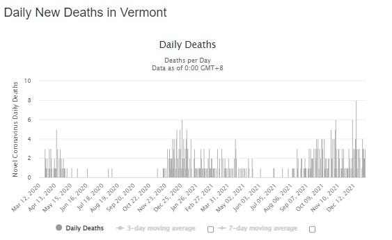
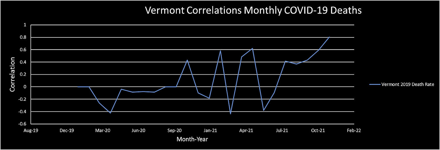
We start here with just one data series, which represents the running correlation between cumulative vaccination rates and monthly COVID-19 mortality. It may seem weird that the correlations begin prior to vaccine rollout, but there is no reason that we cannot compare today's vaccination rates to data that goes further back. And in fact, that can sometimes help us understand if there is a pre-existing mechanism for a correlation. Overall, it looks like more vaccination associates with slightly lower mortality. But since that is true in both 2020 prior to vaccine rollout to a similar degree as in 2021, the most basic assumption would be that the vaccines didn't really change anything. In fact, it looks like Vermont is doing slightly worse since the vaccine rollout. This jives with the Worldometer data, which shows around 120 COVID-19 deaths prior to vaccine rollout and 360 since, most of which occurred in the latter half of 2021 after most residents were fully vaccinated.
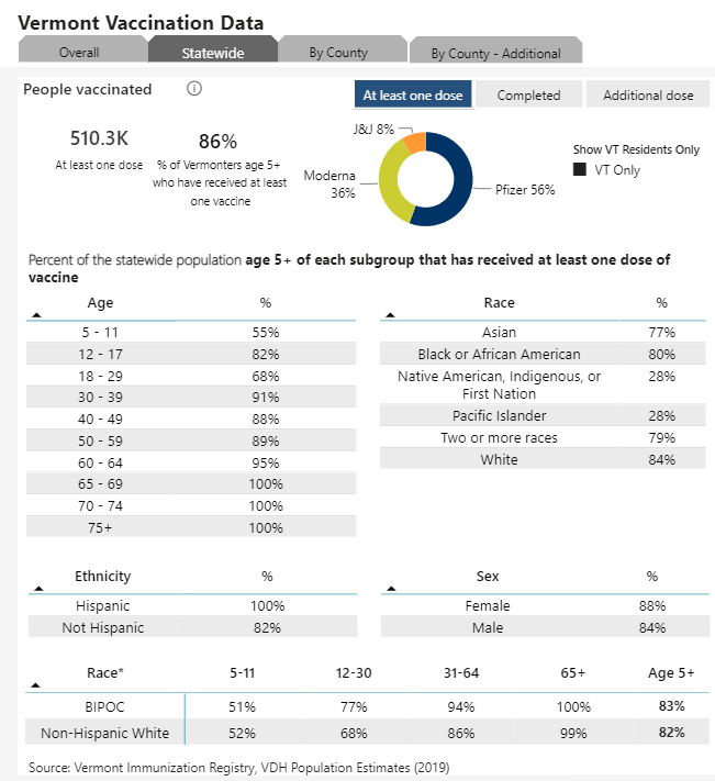
Vermont is the most vaccinated state in the U.S. with more than 77% of the population fully vaccinated before the end of 2021 (86% of those ages 5 and older, and 100% of those 65 and above). That includes nearly all the high risk elderly (healthvermont.org), which is to say that almost everyone who might die of COVID-19 seems to be fully vaccinated by now!
Since vaccine rollout, Vermont has around three times as many COVID-19 deaths as prior. Cases have surged, too.

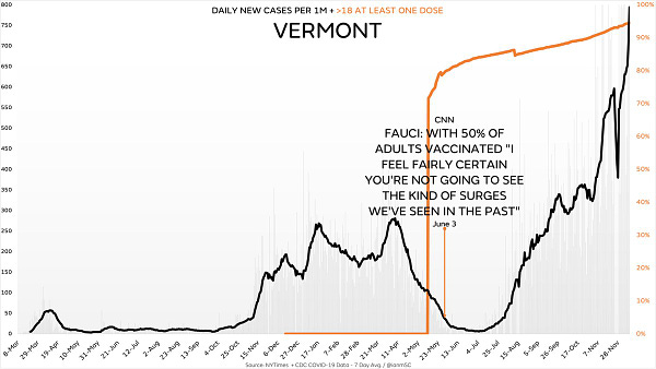
Are all those deaths happening in the 64-and-under crowd? That seems essentially impossible for a disease where around 75% of deaths occur among those ages 65 and above. If vaccines prevent all those deaths, or even 90-95% of them as is often claimed. A blanket 90% efficacy rate in preventing death should result in around a 92% reduction in mortality given the age demographic statistics above. But instead of 8% as many deaths, we're see 300% as many deaths, which is 37.5 times what we would expect had Vermont not vaccinated anyone. Or perhaps we should see even less than 8% since many high risk elderly would have already died in 2020 (so 37.5x might should be 50x).
If nearly all these deaths are among the unvaccinated, then we should see a negative correlation between 2019 death rates (which should be higher in states with more elderly) and 2021 COVID-19 death rates. Do we? No.
But the hospitalists swear that this is something like a pandemic of the unvaccinated.
Really?!
Now, let's take a look at all-cause mortality in Vermont:
The dark line (deaths) goes above the green dotted line (normal) in February 2021 during vaccine rollout with the elderly, and then not again until the second half of the year after most vaccines had already been delivered. There is no evidence at all in these charts that the vaccines are helping anyone, and plenty of evidence that they might be hurting people.
While we don't have "proof" that the unvaccinated non-elderly aren't seeing a 50x spike in relative COVID-19 mortality, we should require extraordinary evidence that all those COVID-19 deaths are strangely packed into that tiny unvaccinated demographic (that seems to be mostly little kids and 20-somethings who really don't want myocarditis).
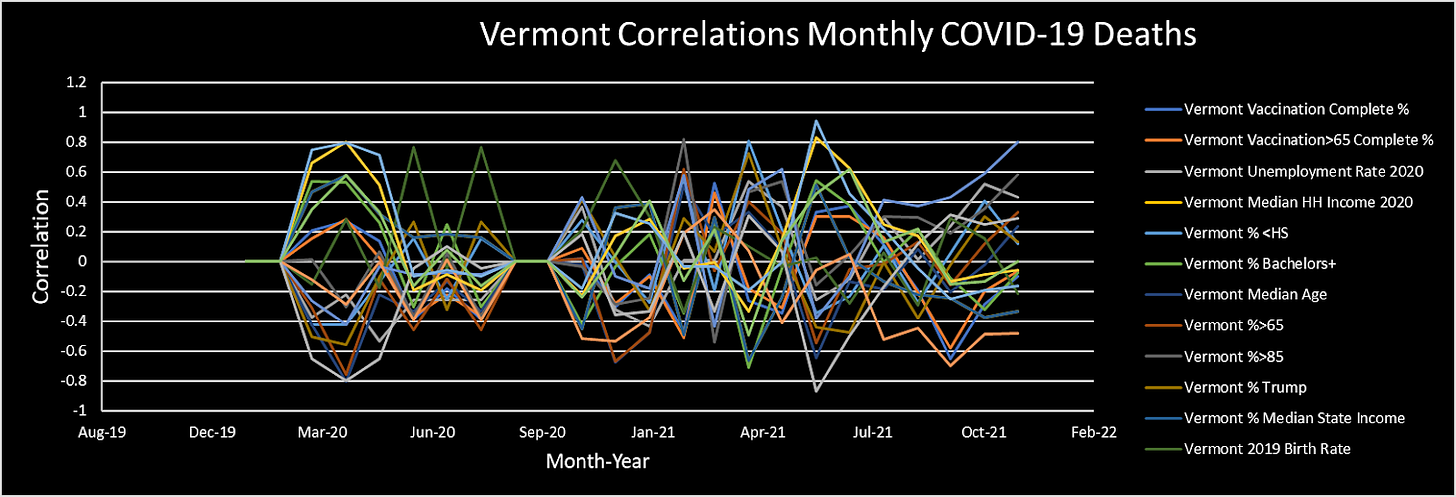
Now, back to my correlation charts. Let's add a variable that I've previously seen associate well with COVID-19 mortality: county unemployment rates.
Now we see a variable whose correlation has grown stronger since vaccine rollout. And it fits with the most basic intuition that disease follows poverty.
Next, let's see if voting for Trump killed people since the start of vaccine rollout…
It doesn't appear so. Being black seems to be slightly correlated with worse outcomes, but given the racial demographics of the unvaccinated, I don't see a unique relationship in the data. So, congratulations, Vermont—you're not a particularly racist state, apparently. Except in June. Work on that.
Hopefully adding one variable at a time helps you get a grip on how to better see correlations over time. After a certain amount of practice, you might be able to tame the whole jellyfish at once.
In summary, Vermont is a case in point that the messaging of the "pandemic of the unvaccinated" is an absurd (and dangerous) joke. If public health officials and hospitalists really wanted to help people, they'd preach vitamins (D in particular), zinc ionophores, and basic hygiene of rinsing oral and nasal cavities before and after infection because clearing away as much viral load as possible while it's mostly still at the ACE2 receptors outside the lungs and bloodstream.

That concludes today's statistics lesson. I hope it was helpful. I may drop some more state level charts in the coming days.




Great data and analysis to share with my [unvaxxed] daughter as she finishes her applications to Biostats graduate programs.
In normal times, you’d think this data would be enough to make people say, ‘Hmm, maybe we have a problem here…’
Instead we get commercials from state health officials telling people to jab your 5 year old. During Christmas, in the NY/NJ market there was a commercial of a kid writing a letter to Santa asking for the vaccine for Christmas!
WTF?!?