"90% of selling is conviction and 10% is persuasion." - Shiv Khera
While I was in San Juan, I talked with a wealthy cryptocurrency entrepreneur who was worried that pandemic policy and effect could be used as a tool to manipulate the electorate, if not attack one side ahead of something like a civil war (I'm taking small liberties in description of his concerns). I told him that other than the young-old (Blue-Red) correlation, I had not seen specific evidence of that, though the notion that democracy could be steered by culling the old should concern people (as should all engineering of democratic power illusions).
What I do believe with greater certainty is that applying pressure on people to take experimental vaccines effectively engineers an obedient workforce with defined and manipulable groupthink. If this is not already a crisis of governance, it will precipitate one---particularly if rapid economic consolidation continues unabated.
Source: Vincent McCarthy
Throughout the pandemic, I've seen some back-and-forth between partisans with attempts to put the blame of the pandemic on the other. My gut instinct is that a portion of the top 1% wants the bottom 99% bickering among themselves instead of looking more closely at the work of Anthony Fauci, Peter Daszak, Ralph Baric, and others. But that doesn't mean there aren't morsels of truth worth examining?
My presumption before doing a deep dive into the data was that red-blue pandemic correlations would mostly tell us about the makeups of those populations, and in ways that we would ordinarily intuit absent the pandemonium of the moment. Let's take a look.
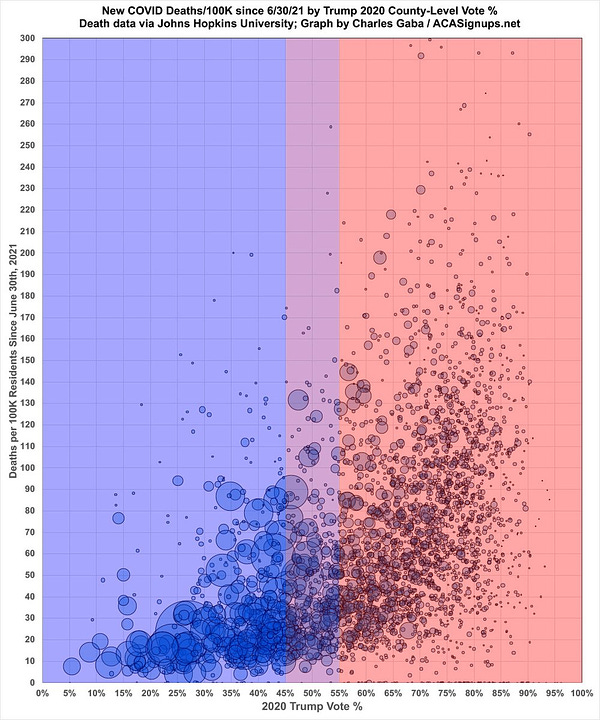
I for one am extremely grateful that Charles the snarky healthcare data analyst came around to finally show us America. Now, if we could only get somebody to write the Great American novel coronavirus (har har).
But what is Charles really saying, and what is actually going on in this chart? Is the association real? If it's real, is it meaningful? Is Charles just a spiteful middle manager in the Blue Cathedral?
Is he leveraging the culture war to sell vaccines? Even unknowingly?
But before we dive into the pile of questions that we have…only to inevitably discover that we have more questions, let's examine some data!
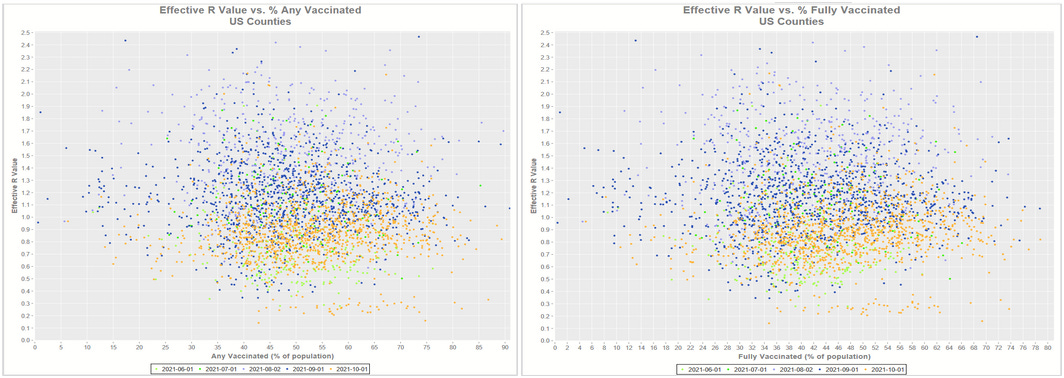
The following plots were provided by Operation Uplift member and computer scientist Timothy Snyder. The scatter plots compare vaccination rates with viral spread across U.S. counties through around the end of the Fall (October). Do you see a trend line? Overall? Or for any one color (month)?
Meh, not really.
Here is another scatter plot with U.S. county data as of mid-August (different Operation Uplift quant), this time with both axes rank-ordered (each number is ranked from 1 to the total number of counties, in strictly increasing order). The lack of clustering is another way to see how little relationship exists between vaccination rates and COVID-19 spread. If the ranks along one dimension had much of a relationship with the ranks along the other, we would see "directional masses" (noisy lines) take shape.
What we see in these charts is that there is no significant correlation between vaccination rates and spread---at least by some definition, which we'll put a pin in and come back to in another article. But this is at least interesting on its own because it presents a puzzle where "efficacy" (defined only as relative risk reduction) of the vaccines occurs entirely without any absolute risk reduction of the system. Unless there is a rise in the total number of cases in the system (which should not be the case this far into the pandemic for a virus with high R), this implies that vaccinating a pool of individuals somehow prevents infections in that pool while pushing infections into the remaining unvaccinated pool. Either that, or somehow, in a way that would seem quite magical, only the people who were never going to get sick got vaccinated (basically). The latter interpretation seems implausible enough (not to mention untrue) to dismiss out of hand, and yet the first explanation seems itself quite unlikely.
So, as I dive into the red-blue question, I see more evidence that is consistent with my theory that the COVID-19 vaccines being used just don't do squat. So, if there is more COVID-19 in red states, my bias is to (1) check the accuracy of the statement, and (2) look for co-correlates that better explain the result mechanistically than "Trumpers so dumb they don't get vaxxed as much."
This is going to get more and more complicated as we go, but let's start with a few simple variables and examine their correlations with COVID-19 deaths by U.S. County by month. Note that the county dataset used here is nearly complete with the exception of some counties in Alaska because something about pigs wearing lipstick.
Here we see that (full) vaccination rates have mildly negative correlation rates with COVID-19 mortality (orange and dark blue), but here's the rub: that was already the case in July, 2020, four months ahead of the rollout of the vaccines. So, it stands to reason that more COVID-19 mortality may have pushed slightly higher vaccination rates in some communities.
My next observation is the one that reaches into the culture war: median household income (yellow) and percentages of residents with bachelor degrees (green) are negatively correlated with COVID-19 mortality, while the percentage of residents without a high school diploma (light blue) is positively correlated with COVID-19 mortality. At least since early during the pandemic.
Let's talk about this.


