Examining Temporal Associations of Post-Injection Mortality
The Vaccine Wars Part XXVII
"The timing of death, like the ending of a story, gives a changed meaning to what preceded it." -Mary Catherine Bateson
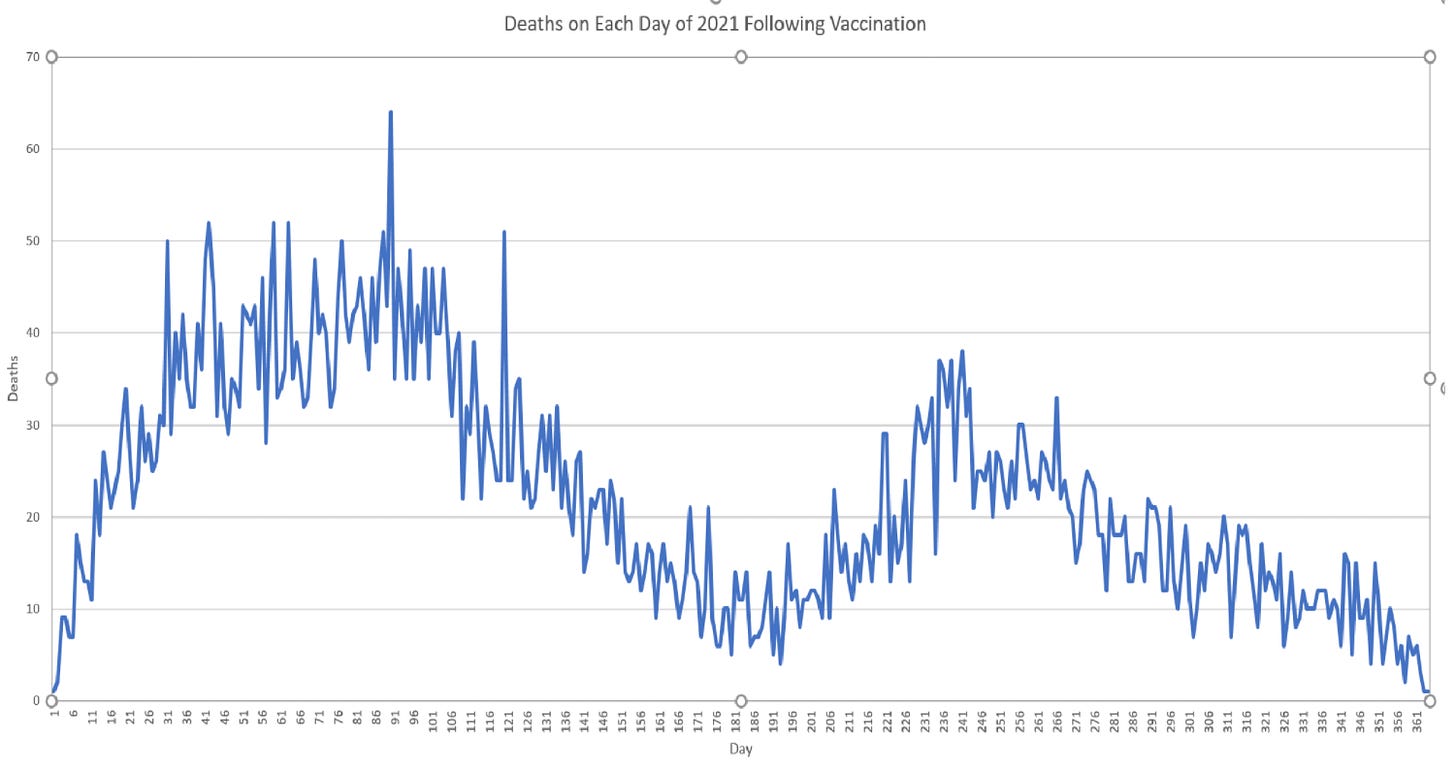
Over the past couple of weeks I've had multiple conversations about the "Second Peak Charts" (SPC) at howbad.info. I can tell that there are slight misunderstandings of the data, so I want to give my own perspective—a mathematical point-of-view. In particular, I talked with multiple people who wondered if the quasi-vaccines had some sort of specific time-delayed effect that could be seen in data such as that which makes up this chart:
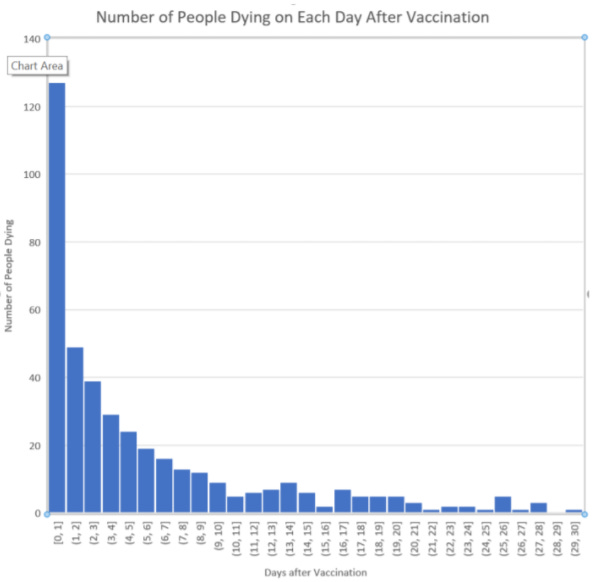
It is indeed strange to see a multi-humped distribution. Those following the VAERS data with open minds are surely aware of the high temporal association of mortality to the first few days after injection. This has been apparent for more than a year—ever since the first few hundred death reports were entered into VAERS.
But my interpretation of this data is different from that of the author of the SPC page—I think that the second hump is most likely illusory. (That is meant to be a constructive criticism, or perhaps merely point-of-debate, and I am grateful for the efforts at howbad.info even where I interpret the data differently.)
Is There a Second Wave?
Is there a second wave of vaccine-associated mortality defined in the data?
And how would we know?
You may look at the first chart I presented and say, "The answer is obviously 'yes'," but I'd like for readers to hold off on conclusions for the basic reason that we should respect apparent temporal relationships more plainly with a strength inversely associated with the time distance between events. Put simply, the longer the passage of time between events, the more likely it is that other (confounding) variables influence the relationship.
Unfortunately, this conversation melts into definitions. What do I mean by that? I'll try to explain it through a narrative:
What would it mean if we found an associated 14 months of lower life expectancy among children who eat potato chips? What if in the population samples that we study, the near-term mortality is essentially identical (tiny tails a sufficiently large number of standard deviations from a mean may manifest as differences that rarely show up in outcomes of even large population samples)? Then what we're talking about are differences in time-to-death that are largely many decades away. Most of the near-term deaths are accidents or based on uncorrelated variables (including the vast variety of other potential health problems). But then decades out, small variations in health finally become amplified into something like a nudge of an ordinary distribution. When somebody dies at the age of 76 who might otherwise have died at the age of 78 based on a variable measured long ago, the cause(s) of death might be many. If the result was a heart attack, there might be many contributing variables, and the 14 months of association of eating potato chips as a kid might really be 8.3 days with the rest causally attributed to otherwise correlated variables. We might "attribute" the death then to hundreds of variables, but otherwise simply say that this person died due to declining health during old age.
Put simply, cause of death becomes more and more philosophical the further out we go on a time scale. It is primarily only for acute causes that are generally immediate we can really put a pin on a cause of death.
It may be the case that vaccine-associated deaths further out than a few days are better viewed as vaccine-associated health declines. And most of the effects may not show up for years to come, and be difficult to trace back to something like a single root cause.
Grant me implausible god-like vision for the purpose of a thought experiment:
How many people do you kill if you give every baby an injection that causes each one of their lifespans to be reduced by exactly 5%?
They don't look happy with your plan. But did you kill everyone with the injection? Or does it feel more correct to say that you harmed everyone's health?
At some point, the distinction is just rhetorical. That's what I mean by the reality of the situation melting into the definitions.
But we're talking about 200-350 days later in the first chart, which isn't exactly long term.
Yes, and this gets us to the tricky part. Let's suppose that we examined only such a chart based on the elderly who made up the bulk of both COVID-19 and quasi-vaccine deaths. These are the people who will dominate any mortality chart, so understanding what happens with them tells us most of what we need to know.
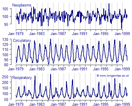
It is a fact that COVID-19 quasi-vaccination campaigns around the world were timed (coincidence theory?) with peaks of flu/respiratory illness season. In the northernmost nations, they started in December 2020 if not early January 2021. Closer to the equator, they started a few weeks later. In the Southern hemisphere, they mostly started during their Winter, which is opposite ours. What this means is that after the first few days, we should see a heavily seasonable component to all-cause mortality among this elderly population simply because we always see that seasonable component. This is true for essentially all categories of death that are most closely related to health—not just respiratory illness.
Source: Longevitas
During the extremes of Summer and especially Winter, bodies are under greater stress. Some of the weaker bodies fade and fail at those times. On the whole, we wind up with sinusoidal-esque curves, give or take some differences in shape and amplitudes. But the periods of the curves are important, and I'll explain why.
Once we start mixing each age-defined demographic into the pool of vaccinated, we begin to blend together different sine-like curves of different amplitudes, but of the same periodicity. However, these other demographics are added to the pool of the vaccinated on lags, so we should see a phase shift in their seasonal trends. How should we expect the graph to look?
Well, what happens when sine functions with the same period are added together?
We get another sine curve (Edit: I meant for the second theta in the first row to have a phase shift added, but lost the LaTeX code already, oops, so just imagine what I’m slightly too lazy to type back.):
Rinse and repeat with all demographics, and you get something like the first chart in this article. This is true whether or not the vaccines cause many deaths 180 to 360 days out. All we need to produce such a chart (a sufficient condition that we know to be present) is for the seasonality of all-cause mortality to be well-enough pronounced.
Understand, I'm not saying that I don't think that the vaccines are harming health, which I expect to be leading to excess deaths N months out, for N > 6. I'm just saying that this is the harder part of the analysis to perform, and the second wave isn't what some people think it is. If I had to guess, we will see waves that asymptotically approach (differences decay) the prior/standard waves over time.
Edit: Whatever you think about the excess deaths pattern resulting from vaccines, understand that (1) seasonal patterns will always exist (and will be part of the overall distribution as per the way waves melt together like sine ways), and (2) even deaths sped up by vaccines will take place more often during peak winter when people’s immune systems are weaker and there is more stress on the system. This is a relatively neutral fact in the whole of the debates.
The Lack of Long-Term Safety Data for Vaccines
Understand that I am now talking about vaccines more broadly.
Let us repeat a statement from earlier:
The longer the passage of time between events, the more likely it is that other (confounding) variables influence the relationship.
Over the years, medical safety advocates (an unnecessary term as the description should be entirely superfluous) have noted the obtuse lack of effort at organizing the systematic gathering of long-term safety data with respect to vaccines. A large pool of data would likely be enough that the pool of honest statisticians (we are apparently a degraded minority) could convincingly tease apart causal variables and put on display the holistic health effects of vaccination. Lacking a large pool of data, that task is extremely messy. There may be results, but they are more easily attacked from positions of "authority" in the Pharma-industrial complex. It is surely for this reason that despite excellent suggestions from experts like Dr. Jack and others on how to rework pharmaceutical/vaccine safety monitoring systems, we're still stuck with clumsy systems like VAERS that can only be piloted well by the likes of Han Solo or Jessica Rose, PhD (and probably a few modelers at the CDC who are too psychopathic, too sociopathically vested to speak up, or too scared of the consequences of speaking out).


Very interesting. Funny you should alight on the one aspect that a non-mathematician (me) felt looked “wrong”: the period of the second wave. For reasons I can’t explain, when I heard about a second peal, I had expected it to have a longer period than the first.
But thinking further, now with a toxicologists hat on, what would I expect to see if there were two distinct mechanisms of toxicity that caused death? I believe there are at least two. The first is likely to be due to events that occur swiftly if they’re going to occur in any given individual, such as thromboembolic events. The second is unlikely to kill swiftly, if part because, by its nature, the effects accumulate over time, such as reduced immune defence capability.
What shaped function wuth time might it be most reasonable to expect to see?
I expected it to have a longer period, though I cannot justify why.
I really appreciate your work Mathew. I think there are too many variables in the equation. Batches are different, multiple manufacturers are involved, etc. Add to that variations in the health of the vaxxed population pre-injection, and the thing that actually killed them being often unknown due to an extreme lack of interest from the people who are providing “care”. Maybe the second hump is clotting. Without the real cause of death, it is difficult to say that there is a connection. Probably precisely what they had in mind.
The bottom line is that we are all looking at the same problem, and from every angle it is a catastrophe. Our government and our “healthcare” are reducing our populations, all over the world. They will not stop, and they will never acknowledge that what they are actually doing is intentional. They are not too blind to see this, or too stupid to understand. At any other time in the recorded history of “vaccines” the program would not have lasted one month, and everyone involved would be running for cover. Today, the people who planned and carried out this crime are still at large and in charge.