Other Education Wars articles can be found here.
This lesson is for people who are not as used to evaluating scatter plots. It will likely be helpful to some beginners, and also for some people with a solid foundation who haven't thought about what happens with certain variable relationships over time.
Don't be afraid to scroll up and down to see the variable relationship over time until you've seen the progression of scatter plots two or three times through! They are arranged in chronological order, and tell a story (calm, chaos, then return to calm).
Don't worry much about the R^2 calculations. They're not particularly important for this exercise, though those with intermediate stats skills might want to think through why that is.
In my last article, I made hefty use of scatter plots to explain why the Society of Actuaries was incorrect (and irresponsible) in suggesting that the states-level data from the CDC suggested vaccine efficacy (VE). It's a sad day when I have to correct such a group on the meaning of linear regression.
A lot of understanding statistics is picking up intuition from examples. Here, I'm going to relate median household income to excess mortality over the span of several years. Since excess mortality is a statistic that compares mortality at a certain point in time against mortality from that same point on the calendar with respect to several previous years, we should expect for excess mortality to generally hover near zero, but mean revert after going much higher or much lower (than zero).
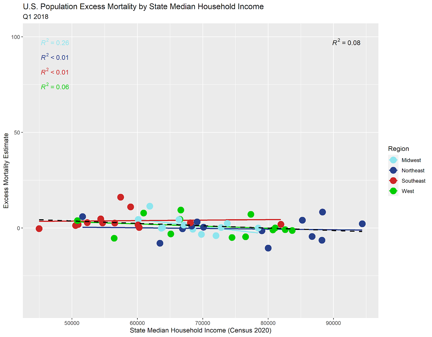
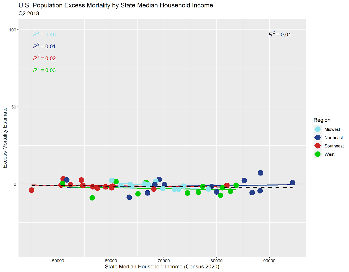
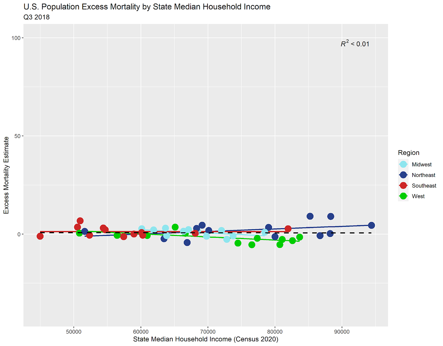
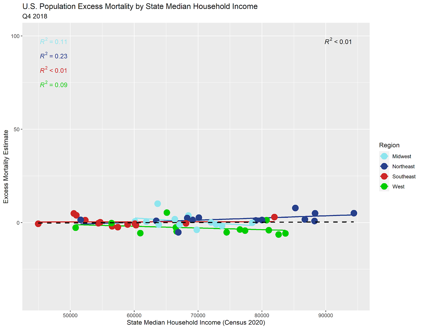
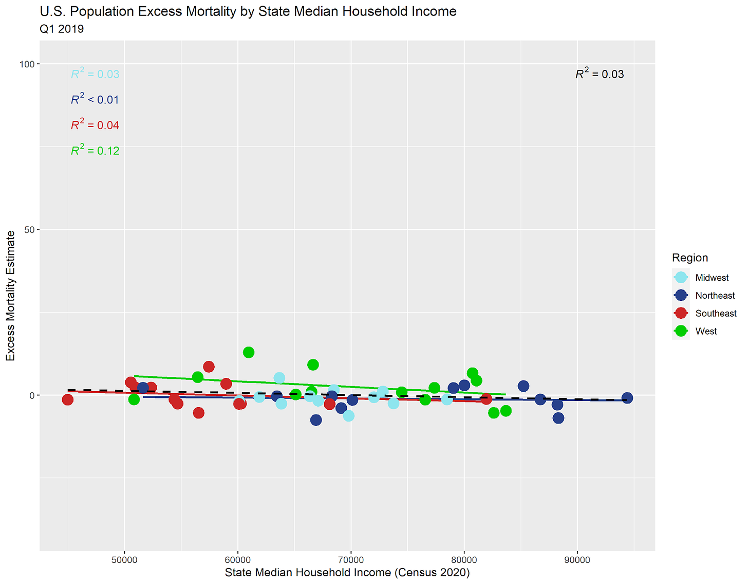
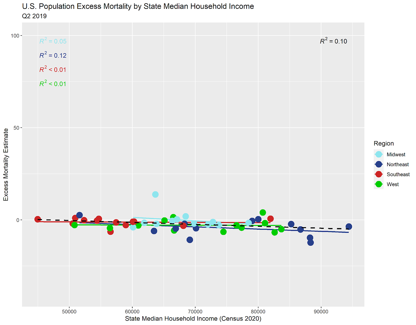
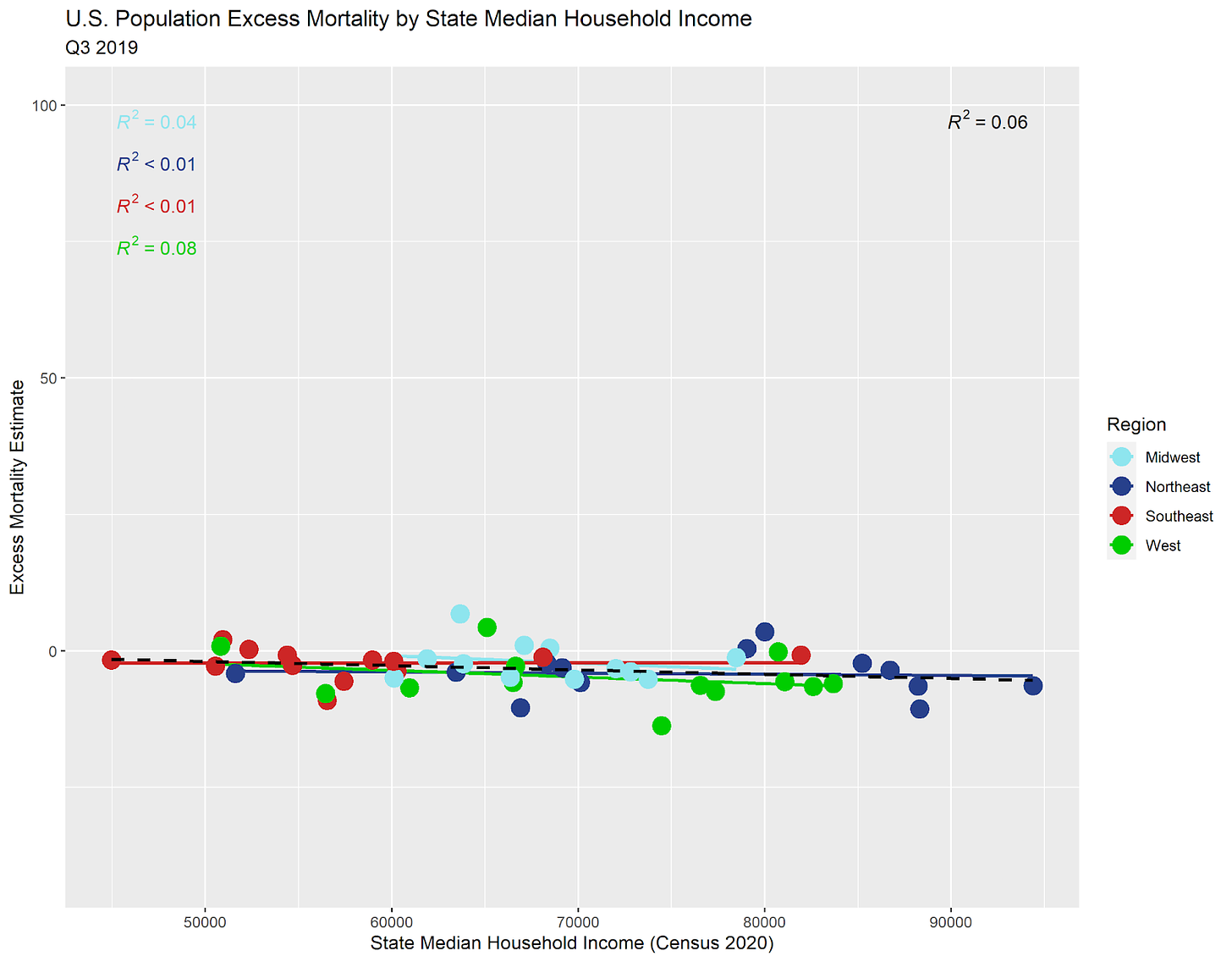
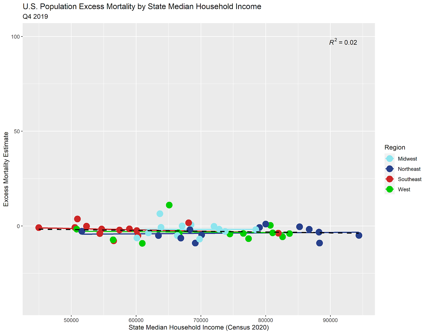
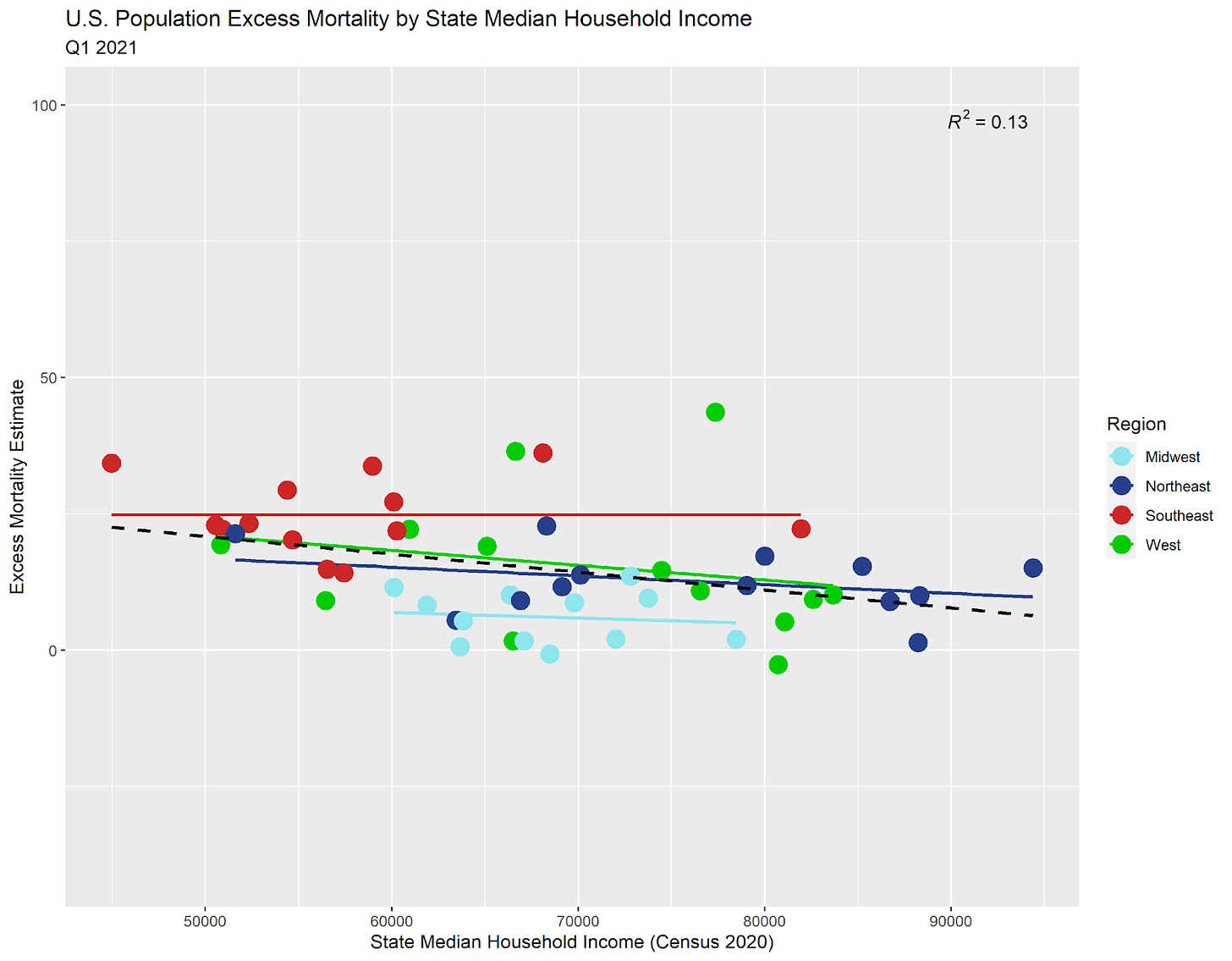
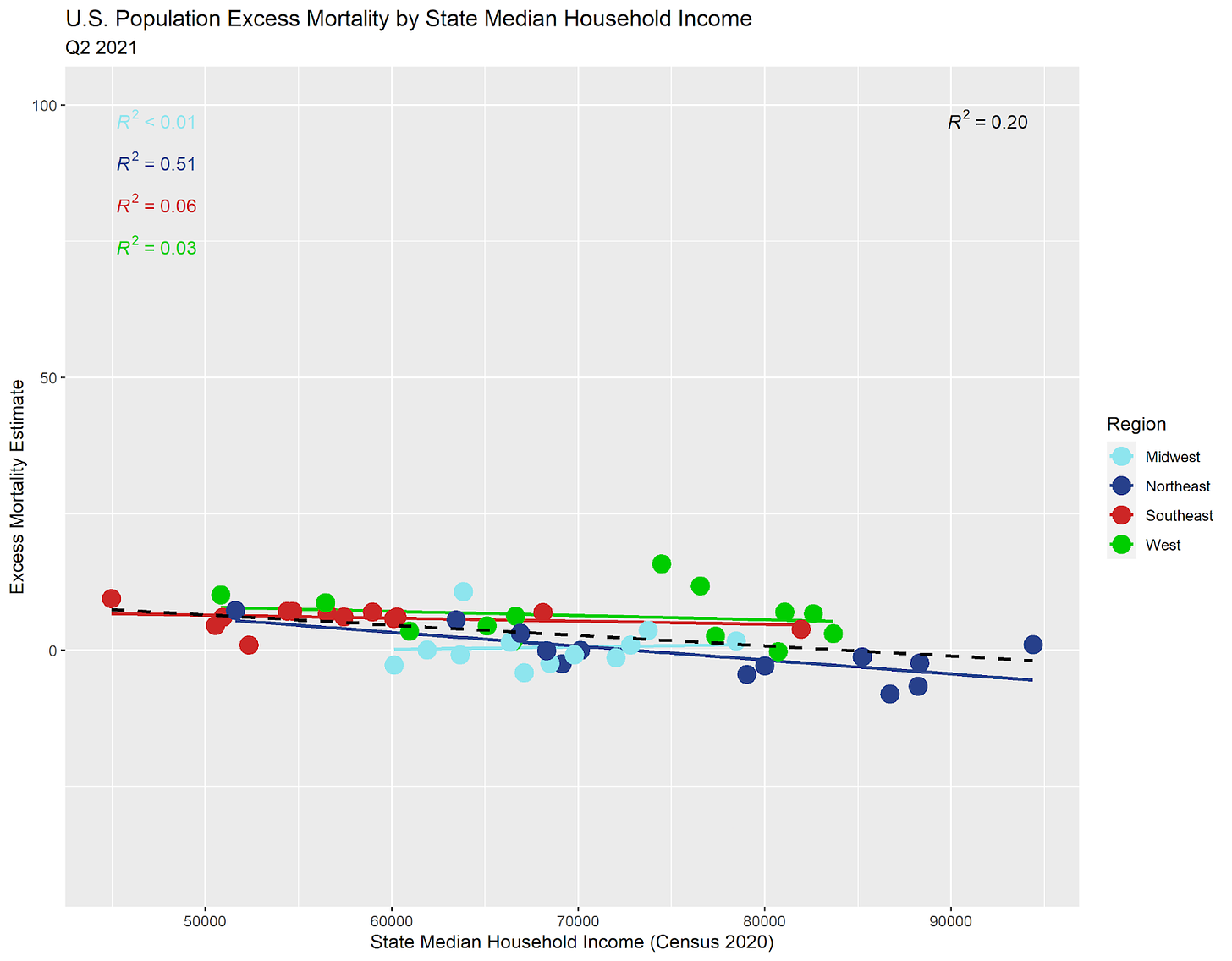
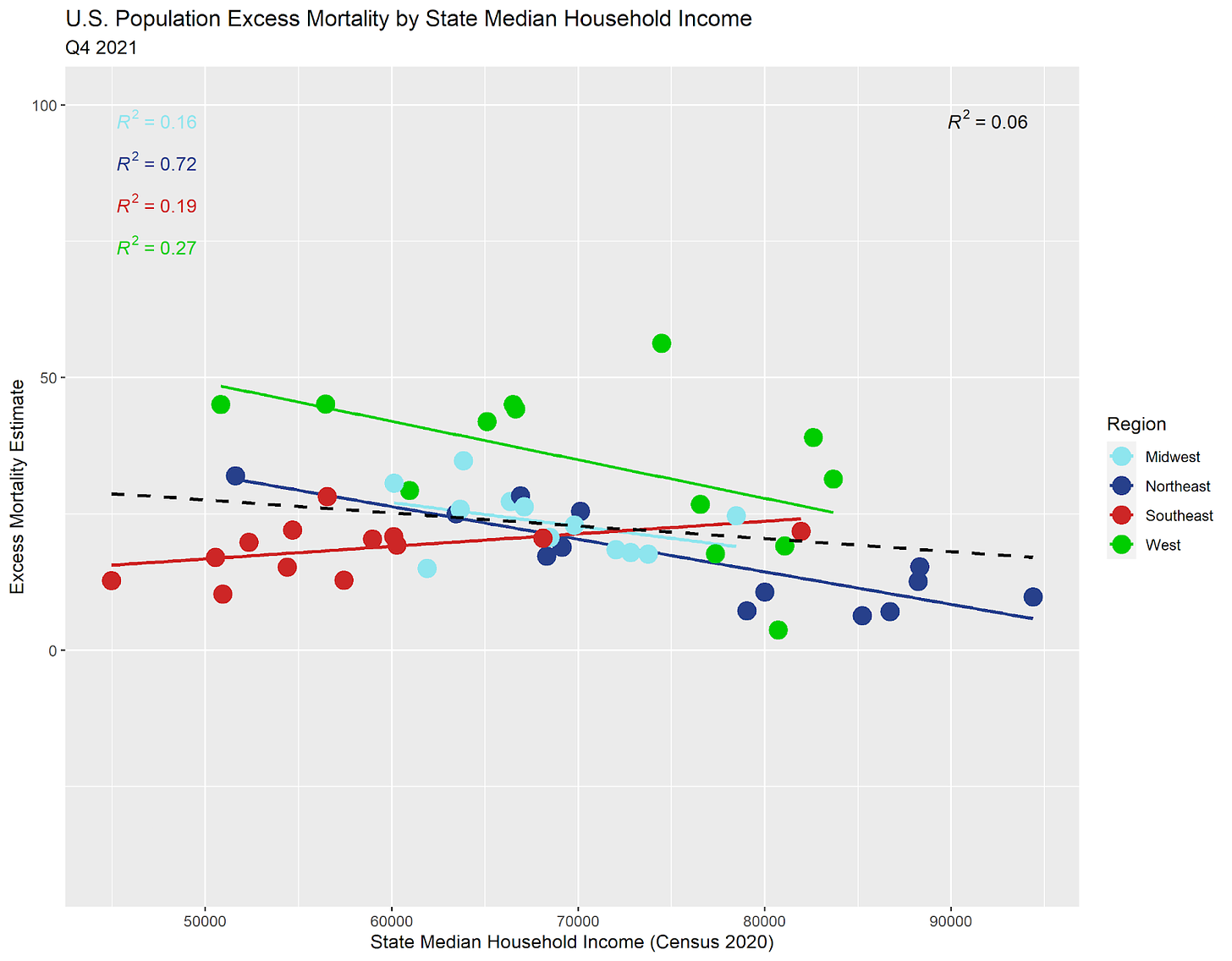
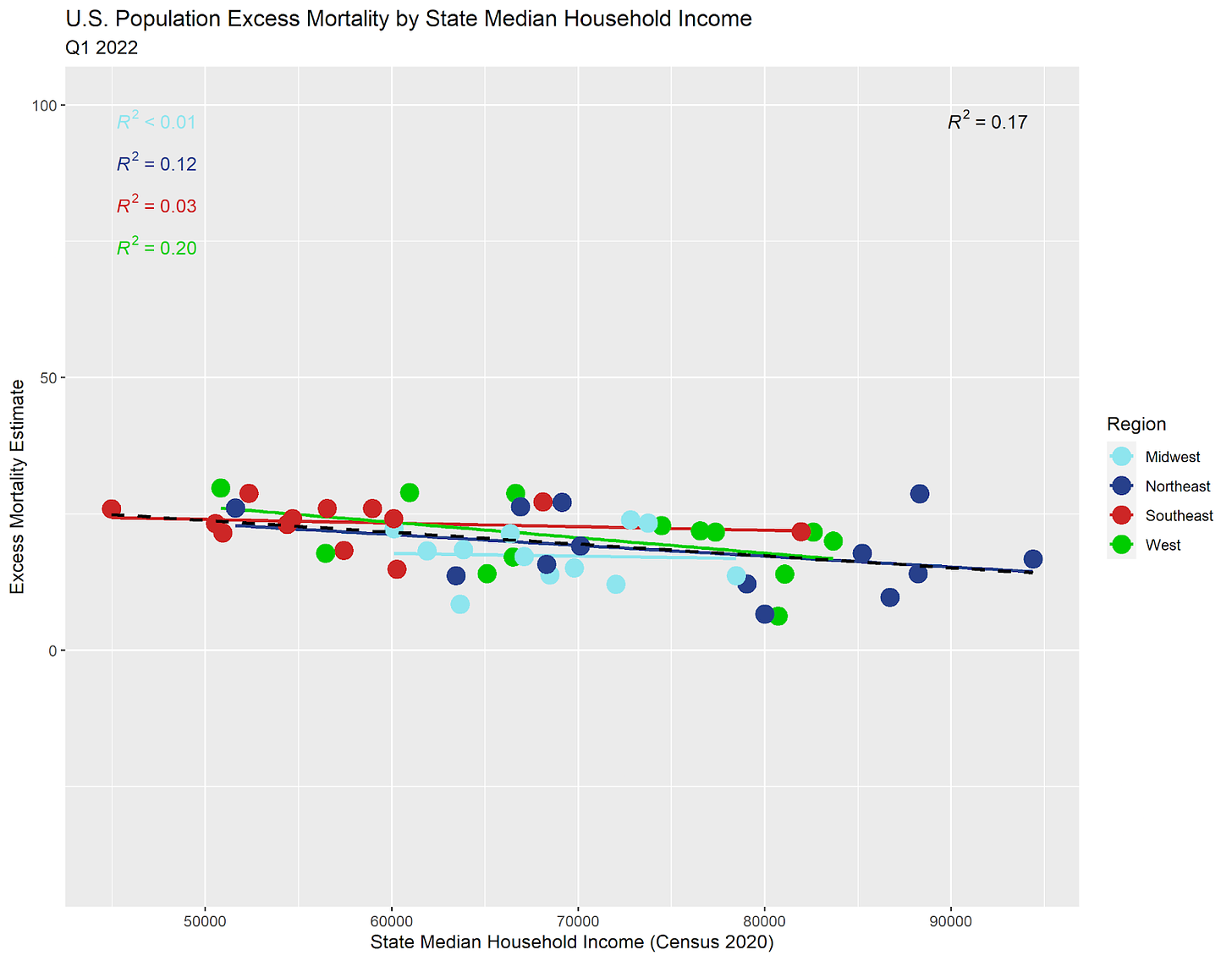
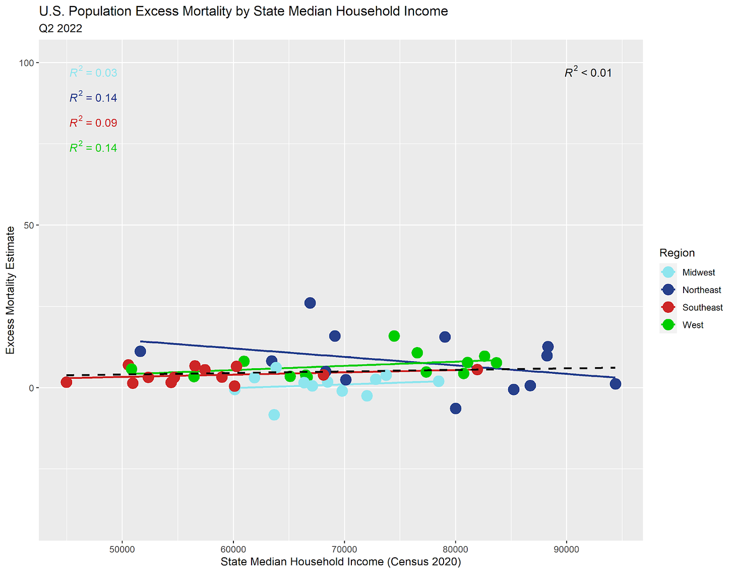
In all following graphs, there are trend lines for each American region and an overall (dashed) trend line. Each dot represents a U.S. state.
Not much to see in the relationship between median HH income and excess mortality so far. This flatness is what we should expect given the mean reversion of excess mortality. Let's move forward a quarter.
Still pretty flat for Q2 2018. You can ignore that R^2 statistic in the upper-right for now. That's a number from 0 to 1 that gives us an idea as to how well the (dashed) trend line fits the data points. We expect for it to be low when the variables are not well correlated (related to one another).
Flat again for Q3 2018. This is going to be like a broken record for a while. Don't worry, there is a point. Scroll through until you see something happen.
Yup, flat in Q4 2018…
Overall, I see more slightly negative slopes than slightly positive ones. I chalk this up to the fact that places with improving wealth conditions see improving health conditions over time, or possibly that the elderly sell their homes in high income states before moving to warming climates with lower real estate prices.
More of the same. That will change when we hit the pandemic…
Yawn. I need more coffee…
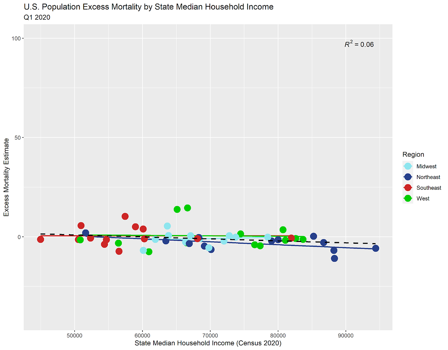
Here comes the first quarter of the pandemic:
Now we're seeing some evolution of the relationship. Just a little…
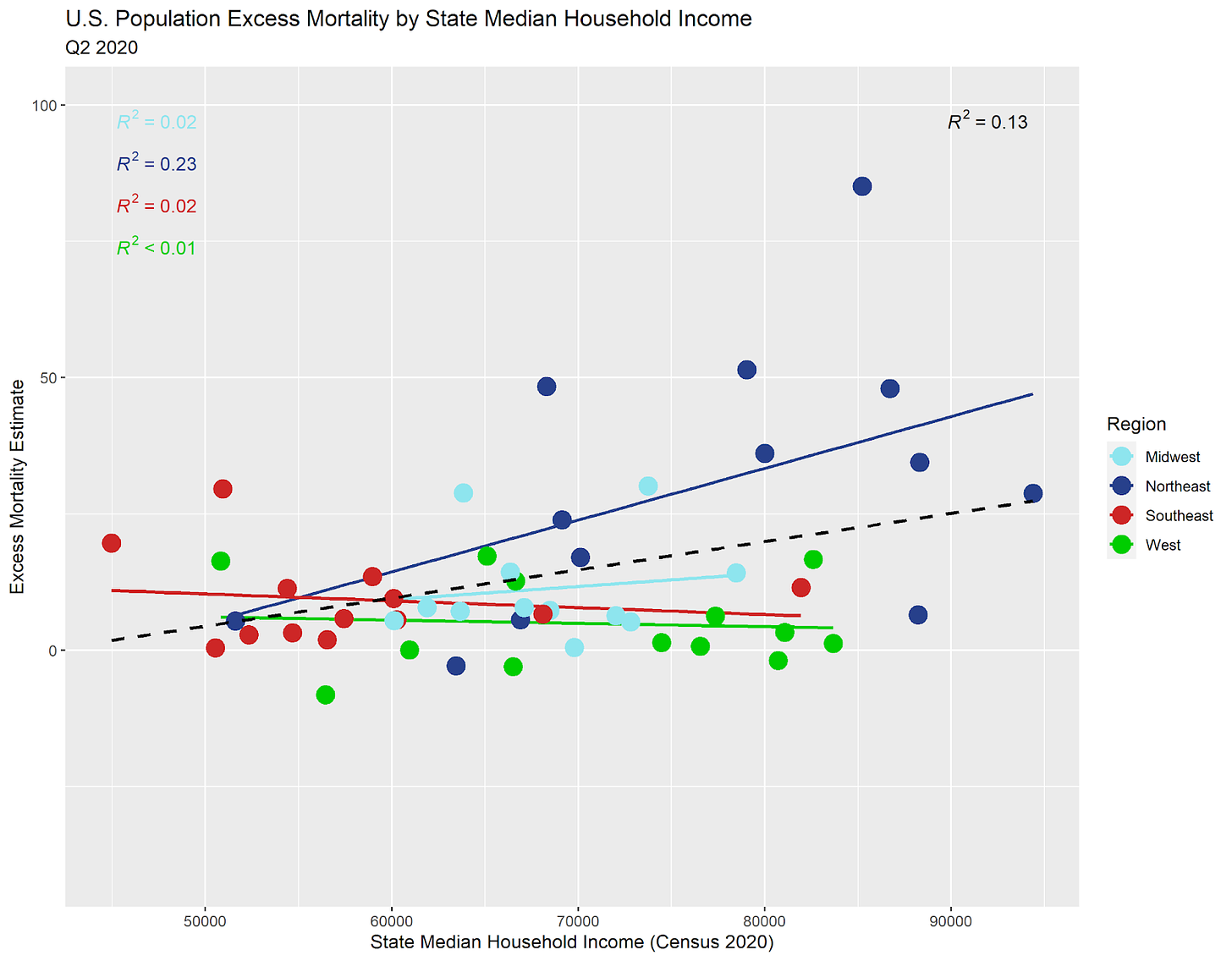
Oh my! The Northeastern U.S. saw by far the harshest mortality leap during the first quarter of substantial mortality during the pandemic. The blue trend line is the sharpest that we will observe in U.S. data throughout the whole pandemic. Not every state saw excess death by this time, but many did. Overall, wealthier states saw more excess death, so we see the overall (dashed) trend line slope upward.
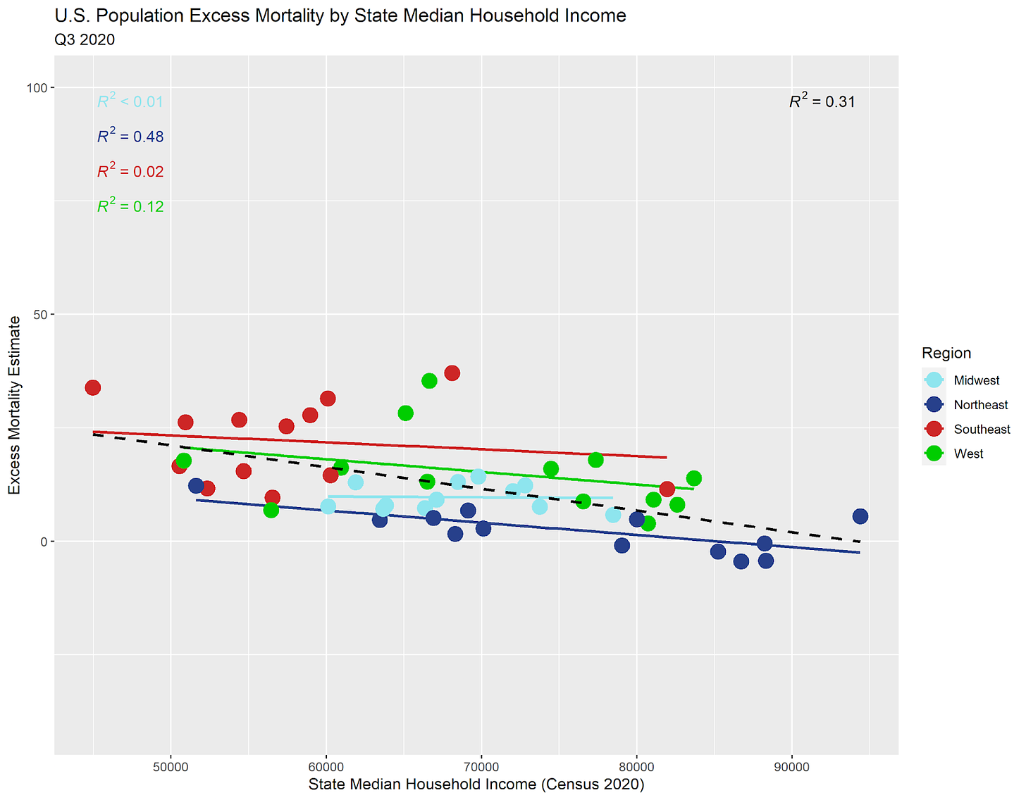
For Q3 2020, now it's the less wealthy states starting to feel the pandemic, while the wealthier states no longer see much excess death. So, the trend line has tilted back negative. We should not expect for the trend to remain highly positive or highly negative for very many quarters in a row due to the fact that excess mortality tends to move back toward zero.
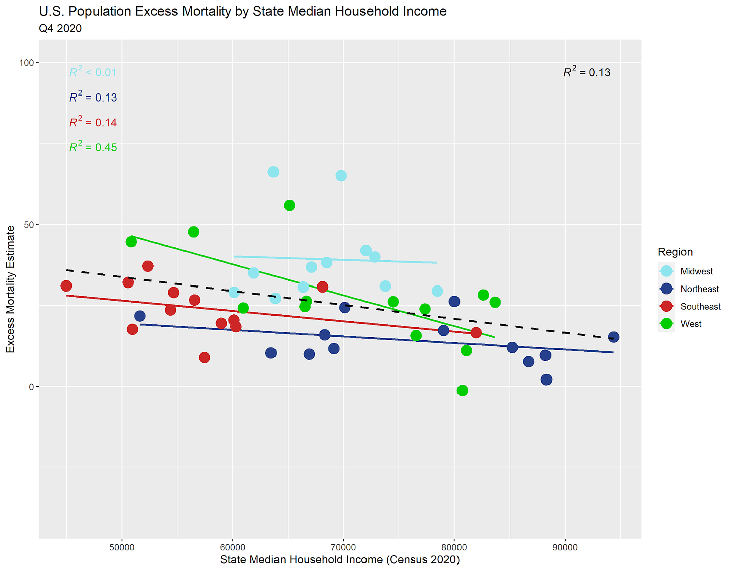
A negative trend again, but the Q2 trend was so positive that this doesn't surprise me. It took two quarters for the poorer states to catch up in excess mortality with the wealthier states. Meanwhile, the Northeast (blue) tend line has been mildly negative for numerous quarters to counterbalance the tremendously positive Q2 2020 trend.
Not too much to see in the Q1 2021 graph except that the Southeast suffered worse this quarter after suffering lower mortality at the outset of the plandemonium.
For Q2 2021, the Southeast and West suffered more excess mortality while the Northeast saw less.
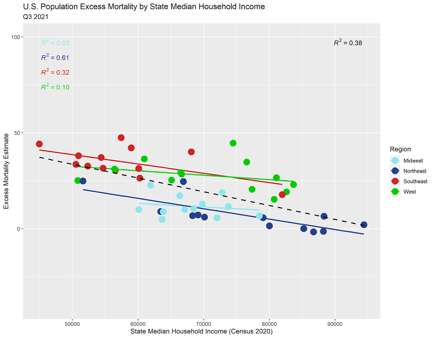
BOOM! This is the "shock quarter" where we would not have expected COVID-19 to have a large effect on excess mortality. Indeed, these summer months saw the second lowest COVID-19 mortality total since the start of the pandemic (Q2 2021 was lower). Yet, somehow, excess mortality really skyrocketed!
The Q4 2021 Southeast (red) trend line had been slightly negative quarter after quarter, and is now substantially positive while the rest of the nation trends negative. But that's what mean reversion does. Everything must tend toward balance.
Are we starting to achieve equilibrium again? Most of the dots are back near the 0 point on the y-axis of excess mortality.
Finally, we see mostly calm again in Q2 2022. We are not quite back to pre-pandemic calm, but the chaos of the sloshing around of excess mortality is settling back down.
Go back to the start and think through the relationship between median household income and excess mortality over time. The trend lines would ordinarily remain flat, flat, flat, and flat again without a pandemic or other major event. With a major event that harms the poor more than it harms the wealthy, we should expect modest negative trends on average.
The Meaning Behind the Shock Quarter
Now, let's go back and focus on the "shock quarter" of Q3 2021.
Remember: on average, the trend lines during a crisis should look slightly negative if we expect for the wealthy to manage better than the poor.
Here are Q2 2020 and Q3 2021 side-by-side.
Most of what we see is that the Northeast experienced dramatic excess mortality early during the pandemic, so there was less fuel for the fire of excess mortality later on. That's it and that's all. Otherwise, the regions around the U.S. saw highly similar excess mortality overall, which is what you expect from a mean-reverting statistic. The only real difference is likely due to the racial demographics in the Southeast, which is home to a higher proportion of black and hispanic Americans who suffered worse COVID-19 mortality overall.
I added the following to my last article:
Addendum (8/25/2022): The following effects converge on the Q3 2021 Shock quarter:
Mean reversion of the Northeast, which suffered greater excess death earlier.
Catchup by the Southeast, which suffered more overall due to greater racial (and probably health) demographic correlations with COVID/Vaccine/General mortality.
Wealth effects add general trend tilt (overly negative sloping) due to a Simpson's paradox, but some of that effect overlaps with the above points.
I hope this is helpful.




You're a good teacher, writer.
I’m slowly starting to expand my understanding around this. It’s like you’re putting the extra crinkles in my brain. Wish I had more teachers like you when I was young.