Distributions (Mortality): Statistics for Street Fighting
Appreciating Mathematical Beauty Volume 6
"Working with statistics from an unknown experiment is like doing a jigsaw puzzle in a snowstorm at night, with some pieces missing, and with no idea what the finished picture looks like." -My topical rewrite of a quote of unknown origin
Find other articles on Mathematical Beauty here.
Steve Kirsch got ahold of some Medicare data and is working dangerously with it.
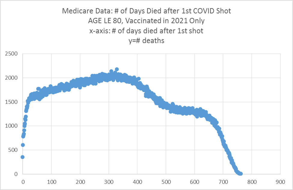
I'm trying to help him sort this out, but as I've said before, that's a full time job, so I shan't be doing it for long. He has graphs of mortality after vaccination that look like this:
The horrors! Or good? Who knows?
What we have is a distribution. Does it tell a story?
Here is what I see:
The sharp rise at the beginning is an acute version of the healthy vaccinee bias. People don't go get vaccinated while on death's door. If they do, a crime has probably taken place.
The collapse of the distribution toward the end just means that the observation period came to a close. Nobody alive has reached 800 days since vaccination because the vaccines weren't available 800 days ago.
The early portion after the initial sharp rise slopes gently upward for a while. That makes sense as a great portion of the cohort gets closer to their end of life, but eventually that very gentle rise should gently slope downward as fewer people are left in the cohort.
There is a sort of hump in the middle that breaks the last point. In technical speak, that's called Omicron. The Omicron mortality spike was sharp, but since people did not get vaccinated at the same time, zero-ing out the horizontal axis to the day of first dose administered means that the number of days to the Omicron wave spreads out.
So far as the general shape of the distribution goes, I see no problem at all. Maybe at every point, twice as many people died as should have, so the distribution shape remained highly plausible? I suppose that's possible, but I doubt it.
Steve seemed to think that it pointed toward vaccine deaths when he posted it, but the shape does not speak to me that way. I think this is a matter of it being hard to understand complex distributions. Essentially, building intuition on non-textbook distributions in real world data is something like a street fighting skill in mathematics. Even very smart people get them wrong routinely.
Am I saying that this distribution shows no vaccine-associated mortality?
There is not enough information for me to determine that, and I'll try to explain why.
The Mortality Distribution
The distribution of mortality in VAERS reports is sharp during the first few days. That's the temporal signal that worries many of us.
Logic dictates that there is a reporting bias toward deaths immediate after vaccination. Would I report to VAERS if my wife died 7 minutes after vaccination? You betcha. What if that were 28 days later? Probably, but that may depend on what's going on in my life. How about a year later? Probably not, but I won't rule it out. I strongly suspect that I'm not alone in setting such priorities in the game of citizen science. What this means is that deaths after the first few days are more underreported.
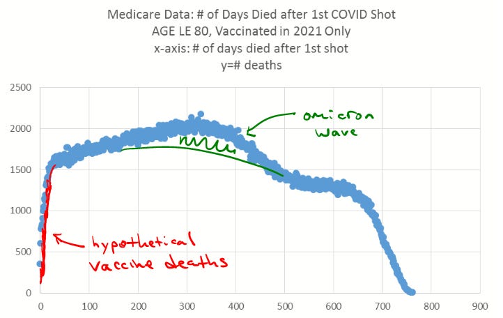
That said, I do think that vaccine-associated deaths are almost surely heavily skewed toward the first few days. I'm going to draw that into the given distribution to portray a plausible scenario.
Sorry, it's actually hard to see what I've done, but I'll explain: I'm imagining that a substantial portion of the deaths on days 1, 2, and 3 are vaccine-associated, but then fewer and fewer thereafter. I'm drawing down from the blue dots to where the natural distribution (were these people unvaccinated) might be. That red portion then represents the vaccine-induced deaths. The shape of the distribution only barely changes!
This is perfectly possible. In fact, if 100,000 Americans died from vaccines during 2021, that would be right around 3% of overall mortality. The red portion plus a handful of other deaths could sum to that amount. The other 97% would be approximately ordinary, and the overall shape of the distribution would remain the same [to anyone without advanced street fighting stats skills]. Note that this number would be similar to my initial estimation from June 2021, and also the German health insurance data.
Further Distribution Confusion
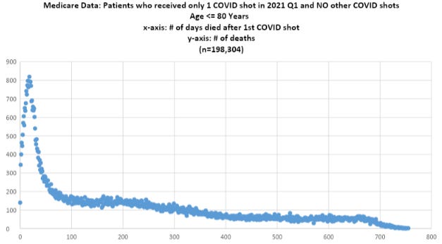
Steve wasn't convinced that my reasoning above is correct. He sent me the distribution of deaths in the Medicare pool by people who took only one dose.
He questioned why we would see this sharp spike in only the COVID-19 vaccines, but not others.
Note the extreme day 0 death spikes for the flu and pneumococcal vaccine mortality distributions. Now that's a screaming signal of vaccine-induced mortality!
But here is what is different about the two latter distributions: people don't fall out of the distribution by taking another day a few weeks or months later.
Normalizing the Comparisons
Is there a way to be certain about whether we see vaccine mortality in the data graphed above?
This is going to be tough, but here is something I would do: divide each data point (total mortality) by the number of person-days (people who survived to at least that day) to get the proportion of the living people who died each day. The distribution of that ratio will be more telling, and its comparisons to other vaccines given to the elderly might tell us an interesting story.
And telling a story is all that statistics can ever try to do. It is always still up to the observer to use discerning and practiced judgment to form a best interpretation, or array of interpretations. Anyone who talks about stats as if they "prove" anything such as causality ("inference") is…selling you numerical snake oil.
Perhaps today or tomorrow Steve will post another article with the distribution of proportions. Even then, there could be base rate issues too subtle to untangle. He has an uphill climb if vaccine-induced mortality is around 3% of the total data, but perhaps there will be a signal in an improved version of the Medicare data.


It is honestly depressing to see that we've reached a point at which a post like this that helps begin to sort away the bad takes, and sort into the good takes, is one of the least popular.
I am to a large extent sheltered from the gnashing of teeth over the specs of the skimpy, corrupted data because of my own real experience seeing morbidity and mortality in a clinic setting where the vaccines were given.
Those of us who are lucky enough (and by lucky I mean the weird kind of “get hated and then fired” kind of lucky) to have had personal experiences of the patterns of vaccine damage need to figure out a way to communicate this meaningfully.
This experience made me absolutely certain of 3 things:
1) the shots flat out killed a bunch of (mostly) elderly folks within a couple weeks of injection #2,
2) masses, just unbelievable numbers of people suffered nasty adverse effects which were absolutely never in any way associated by their healthcare team (in fact rigidly and dogmatically ignored) as being from the vaccine and
3) it would be a stretch to say 1% of these adverse events and deaths were reported to VAERS. Essentially none of them were. If VAERS shows a spike, it’s the tip of the iceberg.
All the comments I see about likelihood of reporting now vs then or at some future point based on psychology and “normal” behaviors, about how physicians are *reQUIred* to report adverse events (lololol) etc. just do not in any way align with my vivid personal experience. Nothing was normal around these vaccines and nothing ever will be. The psychosis, ideologically polarized condition and the mass propaganda coalesced to create a totally irrational and dangerous blinding to reality amongst physicians and patients.
I saw people develop sudden onset severe and disabling conditions, seek medical help for those conditions, ask their physicians if it could be from the vaccine and be told flatly “no”. I saw those same patients plead for exemptions from second doses, still reeling from their first gruesome experiences, be flatly denied exemptions.
My knowledge of statistics is limited and I was born without a graphing function in my brains, but I know these things. These are the things I take to the few remaining cage matches I enter around the vaccines. It would be super cool (in a grim, dystopian horror show type of cool) to see these bits of personal experience validated by real world data, no doubt. But back on planet lies where we actually live, it’ll probably never fully happen in the mainstream.